
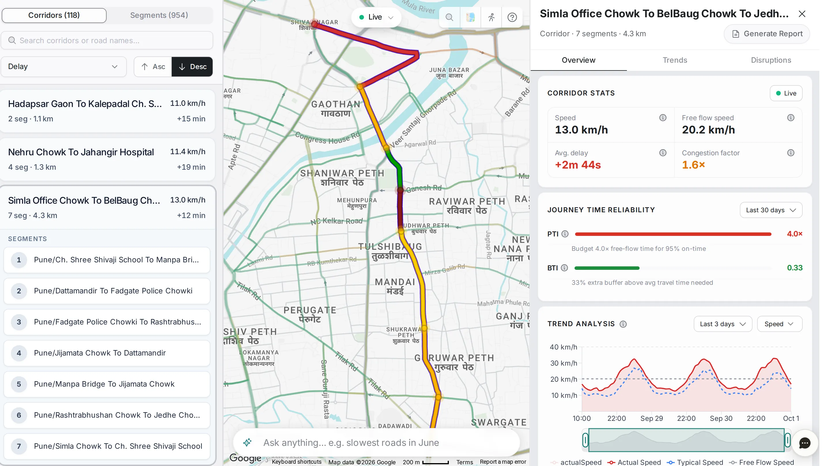
Where Network Analytics shows how the city as a whole is doing, Analytics lets you pick one corridor or one segment and read its speed, delay, reliability and history in detail.
Corridor or segment?
Two tabs at the top of the list switch between the two views, each with its count.
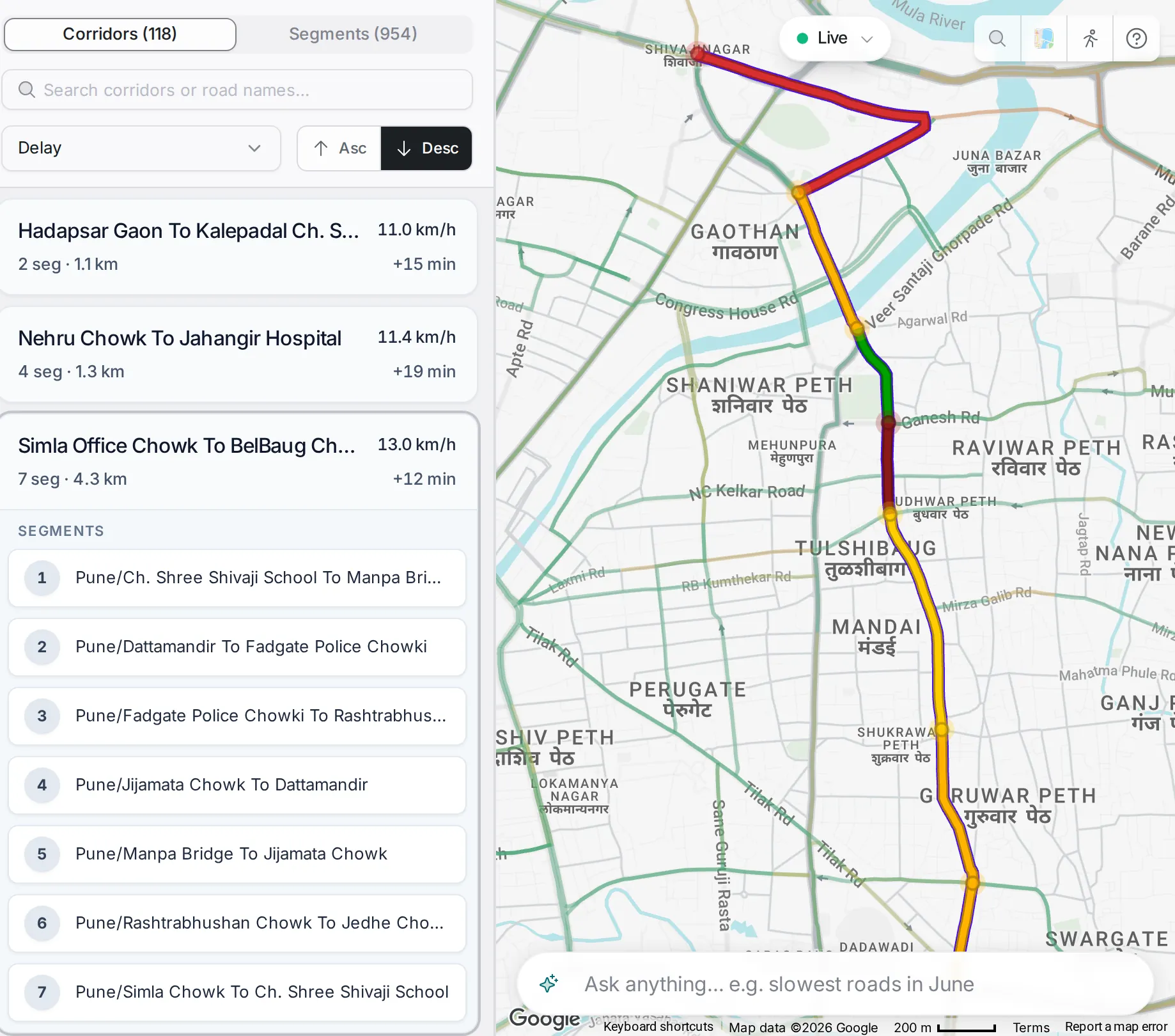
Corridors: chosen routes made of several segments, each grouping a chain of consecutive segments into one corridor. Each row shows the corridor’s name, speed, number of segments, length and delay. Open a corridor and its segments are listed under it, and it is drawn end to end on the map.
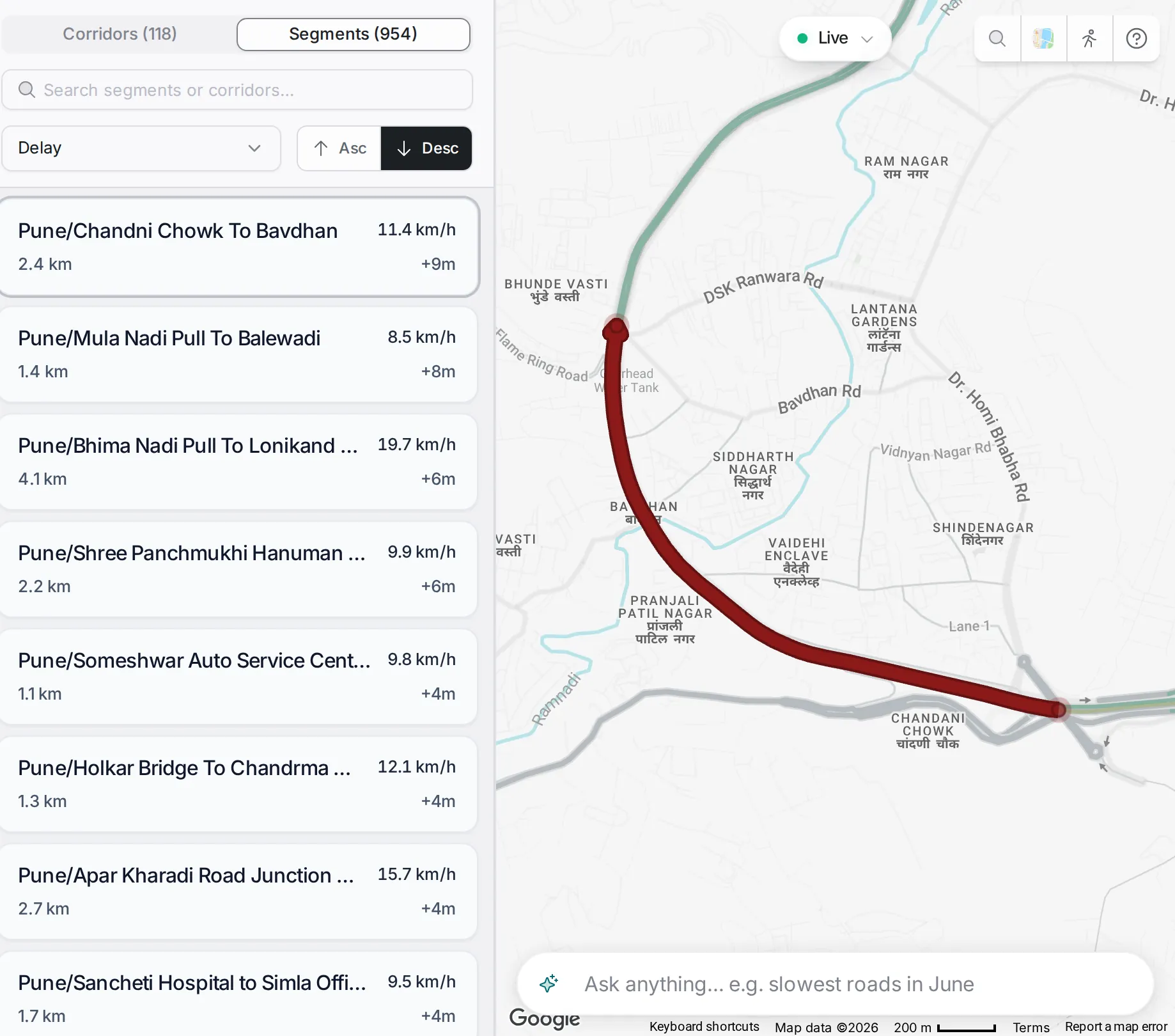
Segments: single roads, the basic unit of traffic data. Use this view when you are following one stretch of road rather than a whole corridor.
You can also go from a corridor to one of its segments: click the segment in the corridor’s list to open its detail.
Filters and controls
The same toolbar sits above the list in both views.
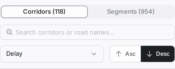
- Tab: Corridors or Segments.
- Search: by corridor name or road name.
- Sort: by delay or speed.
- Order: ascending or descending, with “Asc” and “Desc”.
The list and the map stay in step: pick a corridor or segment in the list and the map zooms to it.
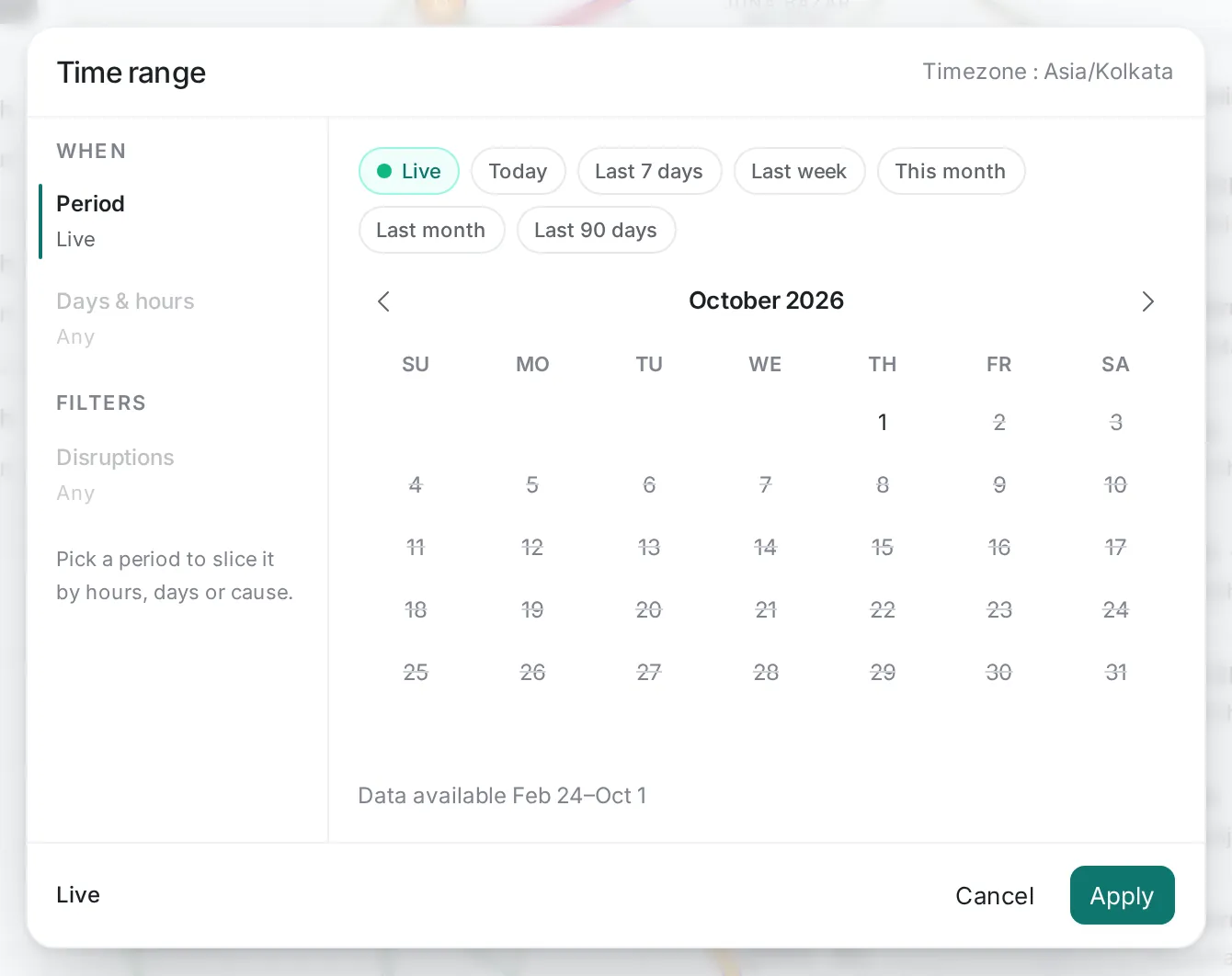
Time range: the “Live” chip at the top of the map shows the time range you are looking at. Click it to pick another: “Today”, “Last 7 days”, “Last week”, “This month”, “Last month”, “Last 90 days”, or days you choose on the calendar. You can then keep only certain days and hours, or filter by disruption type. Times are in the city’s time zone.
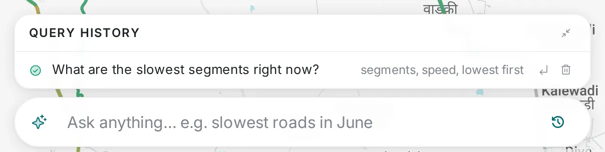
Ask about the roads: the “Ask anything…” bar at the bottom of the map turns a plain-language question into list settings. Ask “What are the slowest segments right now?” and the list switches to segments, sorted by speed, lowest first. “Query history” keeps your questions and the settings each one applied.
The detail panel
Pick a corridor or segment and its detail panel opens. The header shows the name, the kind of item (corridor or segment), the number of segments and the length, with a “Generate Report” button that writes a report on this item and adds it to Reports. Below are three tabs: “Overview”, which opens first, “Trends” and “Disruptions”. Corridors and segments have the same tabs; panels that only one of them has are marked below.
Overview tab
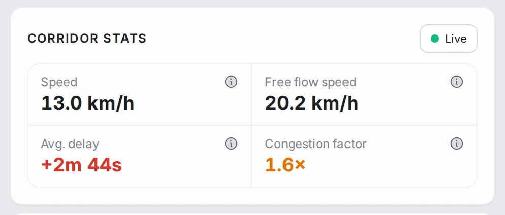
Corridor stats (or Segment stats): the current speed, the free-flow speed, the average delay and the congestion factor: the current travel time divided by the travel time at free flow.
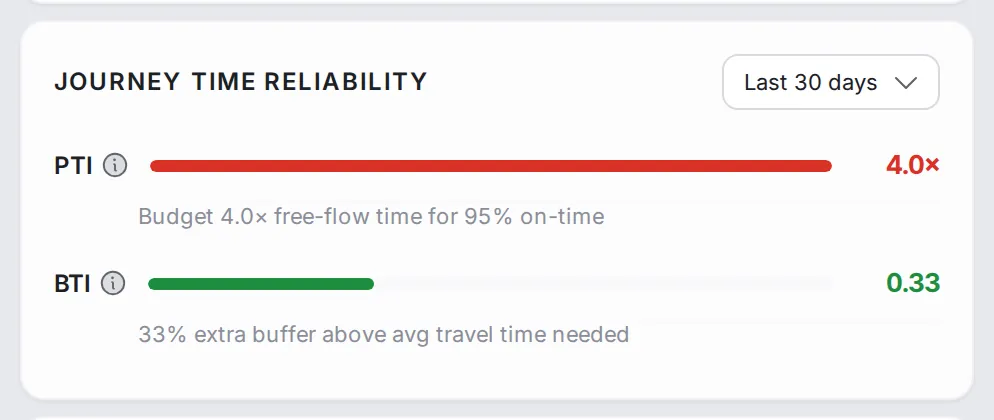
Journey Time Reliability (corridors): PTI and BTI over the last 30 days, each with a bar and a line that explains what it means.
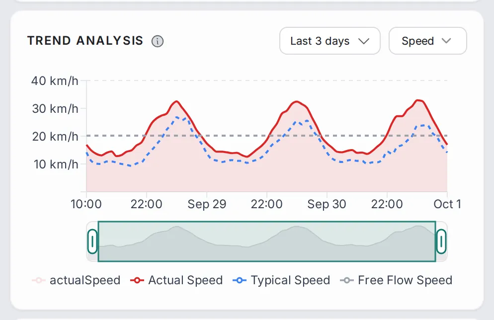
Trend analysis: actual speed against typical speed and free-flow speed over the chosen window (the last 3 days to start with), with a slider under the chart to zoom into part of it and a choice of metric: speed or delay. When actual speed runs below typical speed, the road is slower than usual.
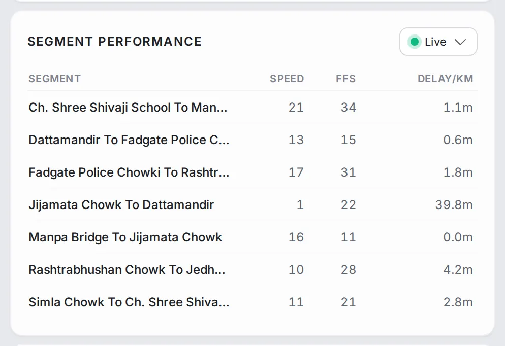
Segment Performance (corridors): a table of every segment in the corridor with its speed, free-flow speed (FFS) and delay per kilometre.
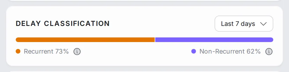
Delay Classification (corridors): one bar that splits the corridor’s delay into recurrent (the daily pattern) and non-recurrent (disruptions and one-off events), to tell a chronic problem from a passing one.
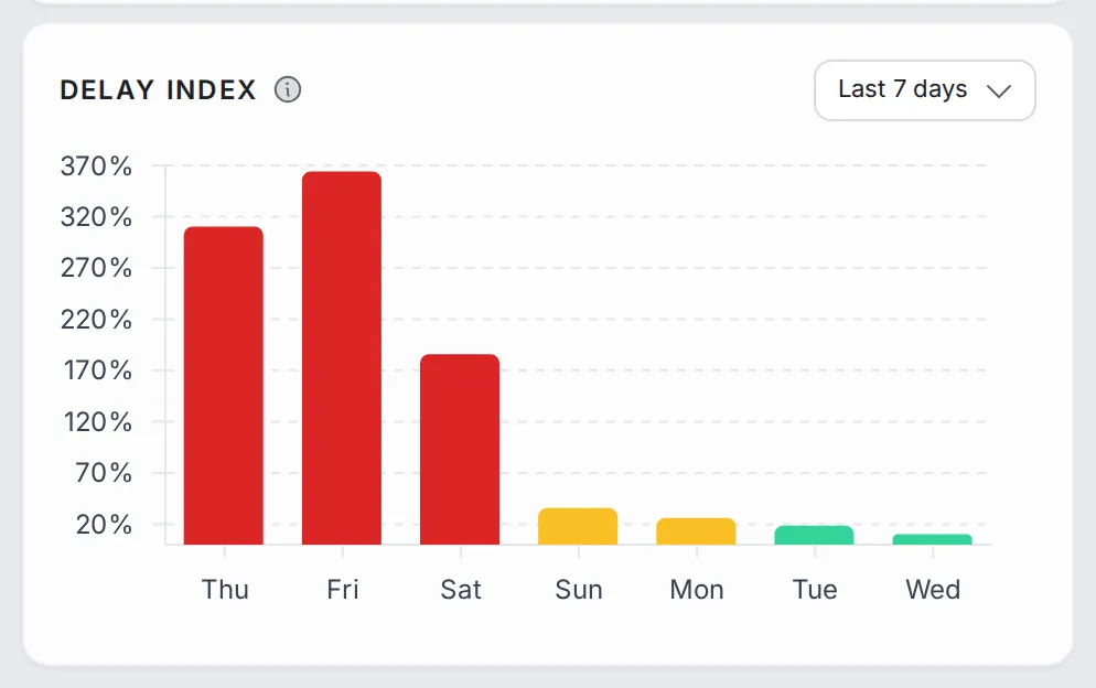
Delay index: one bar for each of the last 7 days, to see whether yesterday was unusual or routine.
Trends tab
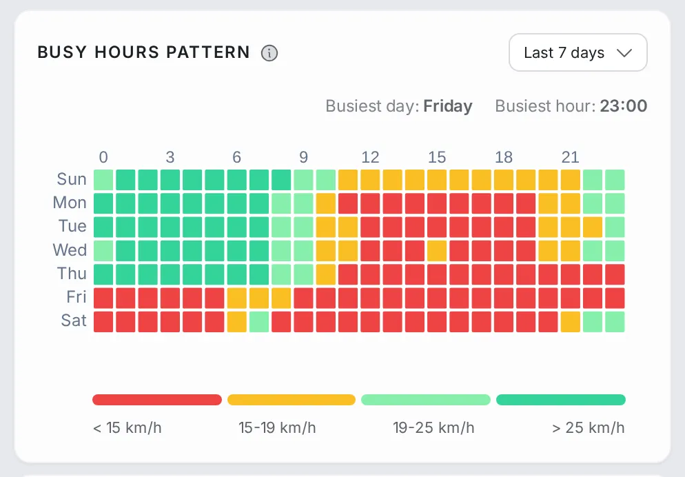
Busy hours pattern: a grid of days of the week by hours of the day, coloured by speed over the chosen window (the last 7 days to start with), with the busiest day and busiest hour called out. A solid red band across the working days points to a structural problem; scattered red squares point to slowdowns tied to particular times.
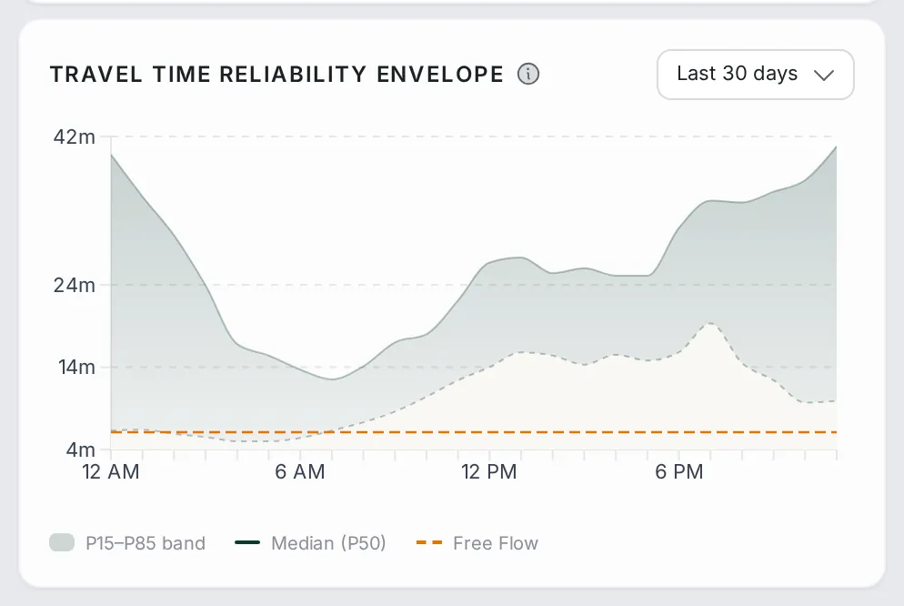
Travel Time Reliability Envelope (corridors): how travel time varies through the day over the last 30 days, with a shaded band between the 15th and 85th percentiles, the median (P50) line, and the free-flow travel time for comparison. A wide band means a trip you cannot predict; a narrow one means a trip you can count on.
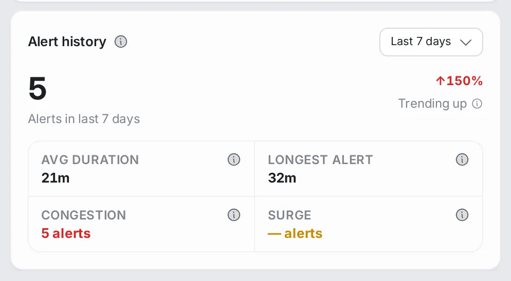
Alert history (segments): how many alerts the segment had in the chosen window and whether that is trending up or down, their average and longest duration, and the split between congestion and surge alerts. When an alert is still active, a banner takes you to it in Alerts.
Disruptions tab
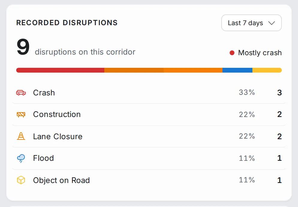
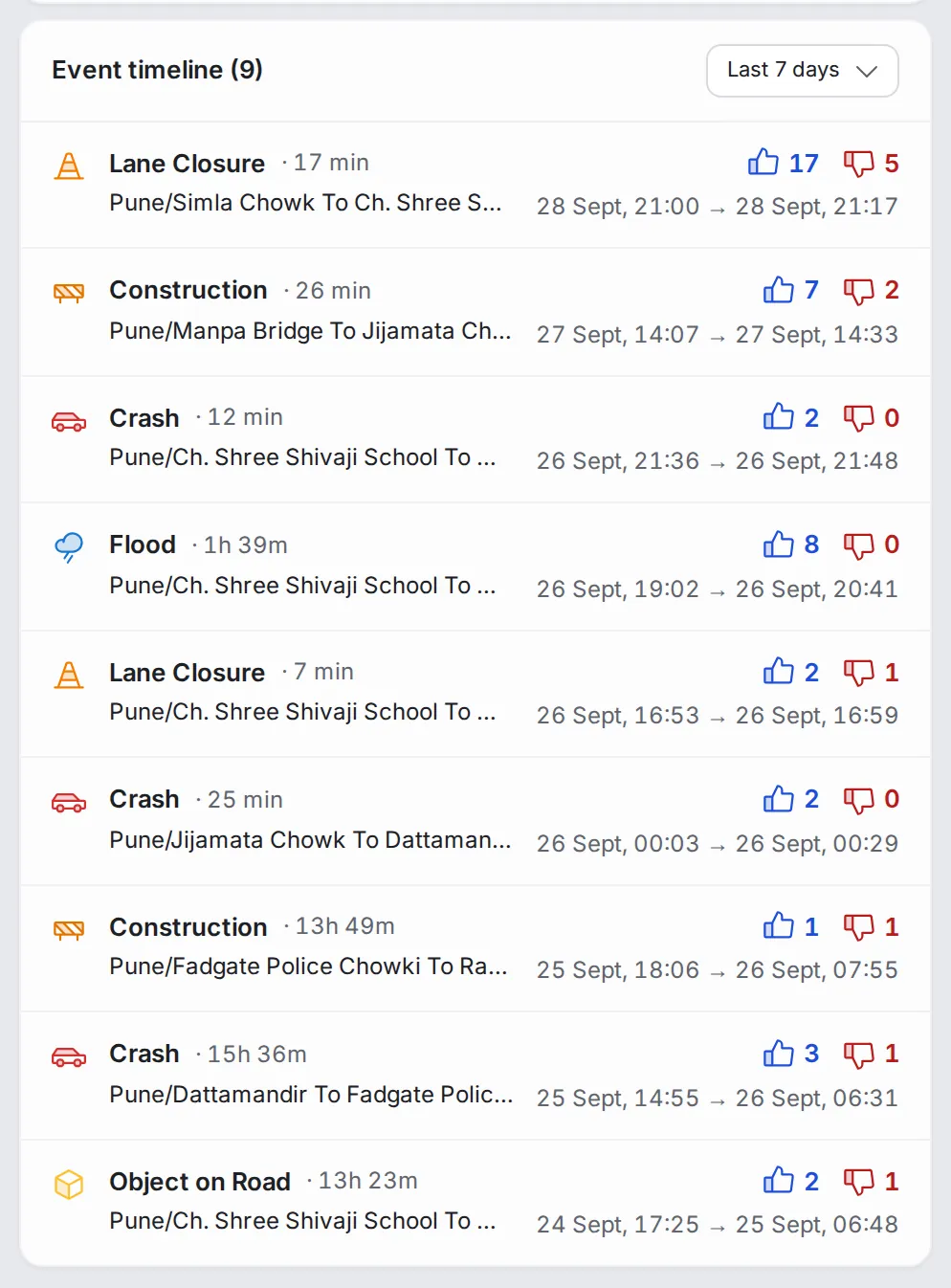
Recorded disruptions: how many disruptions were reported on the corridor or segment in the chosen window, and their split by type, such as crashes, construction, lane closures, floods and objects on the road.
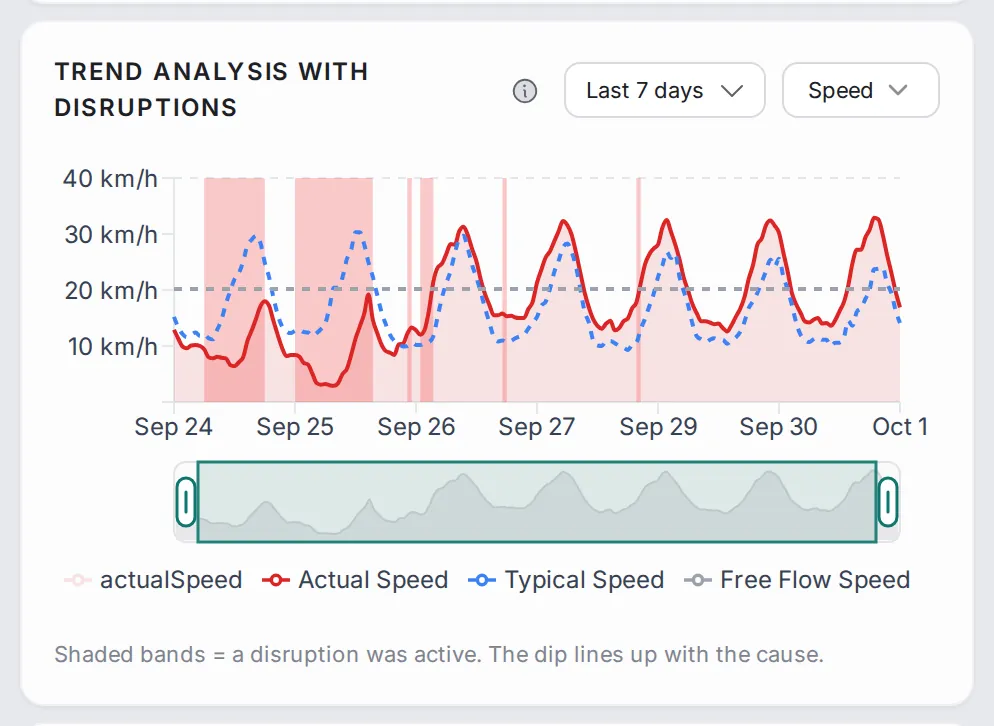
Trend analysis with disruptions: the same speed chart, with the times when a disruption was active shaded, so you can see whether the drops in speed line up with them.
Event timeline: the disruptions, newest first, with the type and duration of each, the segment it happened on, its start and end, and users’ votes.
Common workflows
- Check a report of a slow road: search for the road by name, open it, and compare “Trend analysis” with the “Delay index” to see whether today is unusual.
- Find the slowest stretch of a corridor: open the corridor, read the “Segment Performance” table, then click the segment with the highest delay in the corridor’s list.
- Tell a chronic problem from a one-off: for a corridor, read “Delay Classification”; for a segment, open “Trends” and read the “Busy hours pattern”.
- Judge how reliable a corridor is: read “Journey Time Reliability” for the headline numbers, then the “Travel Time Reliability Envelope”: a wide band means a trip you cannot predict, a narrow one a trip that is slow but steady.
- Link slowdowns to disruptions: open “Disruptions” to see whether a drop in speed lines up with a crash or a lane closure.
- Check whether a fix worked: in the time range, pick a period before the work and one after it, and compare the stats and “Trend analysis” between them.
Who it’s for
- Traffic engineers diagnosing slow roads and checking fixes.
- Operations teams tracking the corridors that matter most.
- Analysts building the case for an intervention with before-and-after numbers.
Related modules
When an alert in Alerts flags a road, come here for its full timeline; when an area looks bad in Area Analysis, drill in here to see which roads are dragging it down. To follow a corridor or segment end to end over time, set up a route in Route Monitoring.
The screen at a glance
Any road or corridor in depth: live stats, reliability, trends, busy hours and disruptions. Hover a number to find it on the screen.
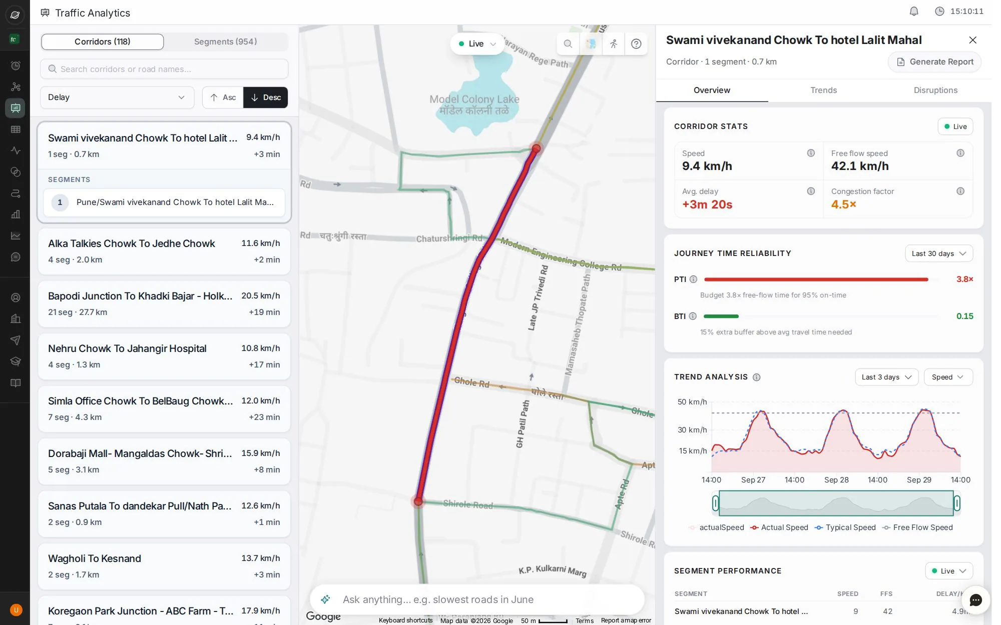
- 1Corridors or single segments
- 2Search by road name
- 3Sort by delay or speed
- 4Live, or any past day and hours
- 5Overview, Trends and Disruptions
- 6Speed, free-flow speed, delay and congestion factor
- 7Generate a report for this road
- 8Ask the map in plain words, e.g. "slowest roads last Friday evening"
Step by step
Guides that walk you through this module in the live app, one click at a time.