
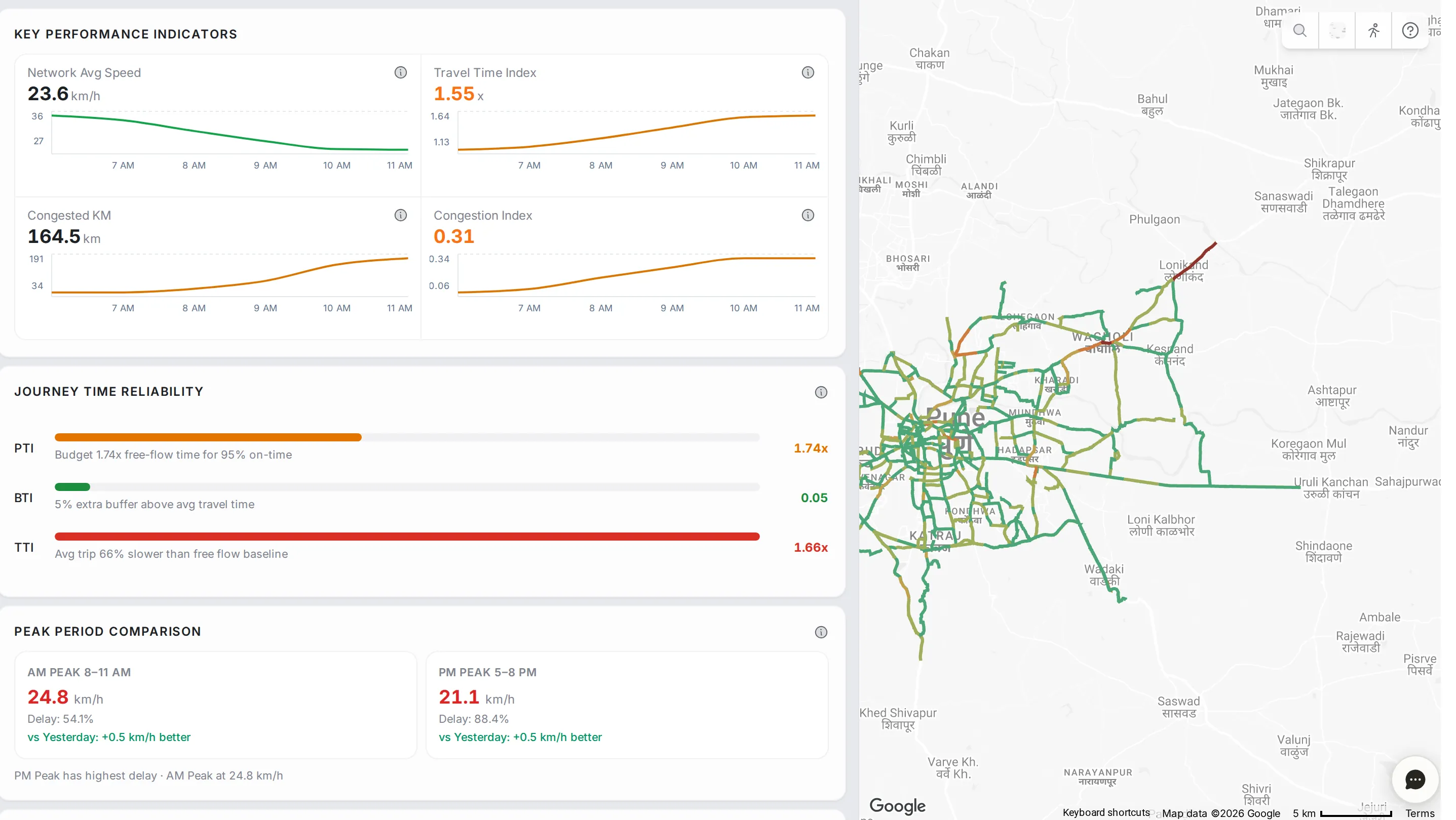
Network Analytics is the top-down view of your monitored road network. It answers one question without opening any single road: how is the city moving right now? Read the page from top to bottom. Most panels carry an information icon that explains how the numbers are worked out, formula included.
Key performance indicators
Four numbers at the top of the page. Each shows the current value and a curve of how it moved over the last few hours.
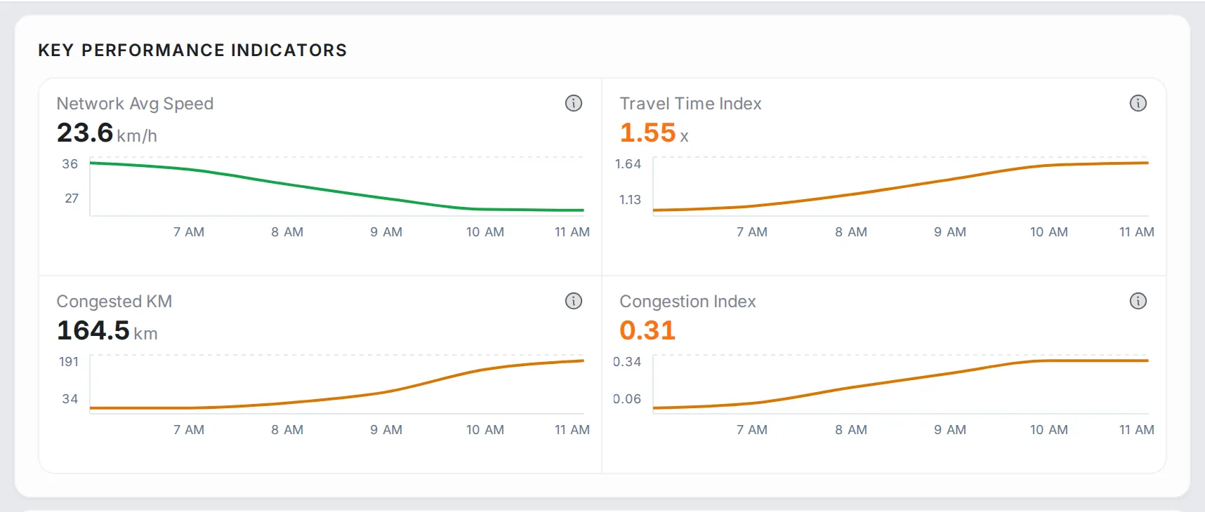
- Network Avg Speed: the average speed of all monitored segments, weighted by each segment’s length. Higher is better.
- Travel Time Index: the average travel time divided by the travel time at free flow (TTI). 1.0 means free flow, 1.75 means trips take 75% longer than at free flow, and above 2.0 is severe congestion.
- Congested KM: the total length of segments whose current speed is below half their free-flow speed (congested km). It measures how far congestion has spread, and as an absolute number it is easy to compare from day to day.
- Congestion Index: a score from 0 to 1 for how far speeds have dropped below free flow: below 0.2 is light congestion, 0.2 to 0.4 moderate, and above 0.4 heavy.
Performance panels
Below the headline numbers sits a stack of panels, each covering one aspect of the network’s performance.
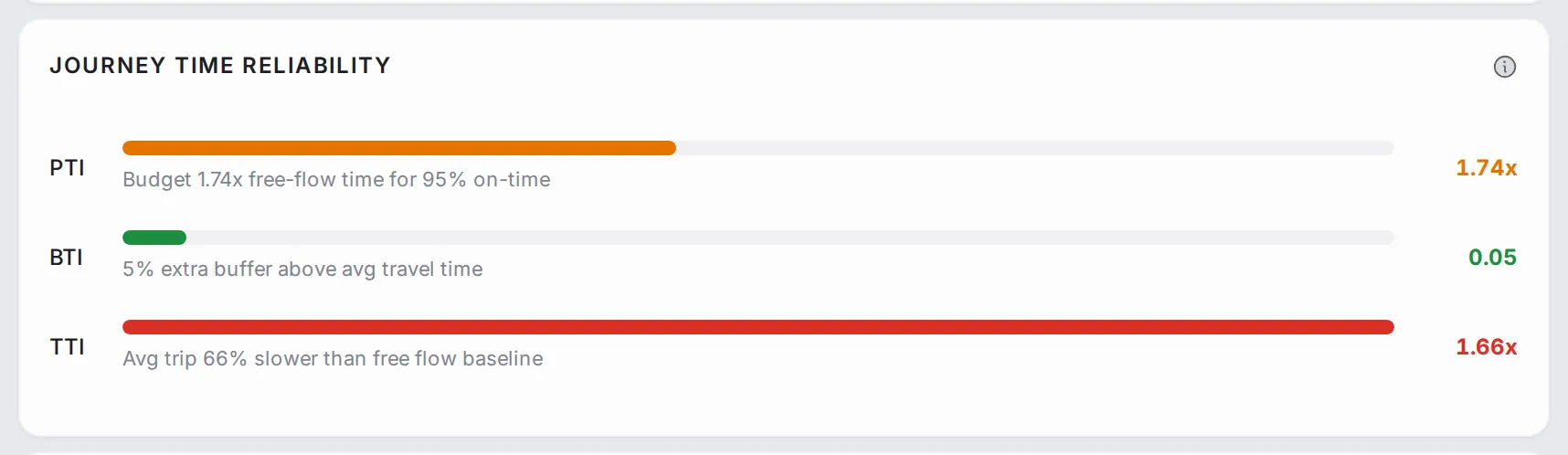
Journey Time Reliability: how predictable trip times are right now, in three bars. PTI (planning time index) is the time to budget, as a multiple of the free-flow time, to arrive on time 95% of the time. BTI (buffer time index) is the extra margin to add to an average trip. TTI compares the average trip with free flow. The longer and redder the bar, the less reliable the trips.
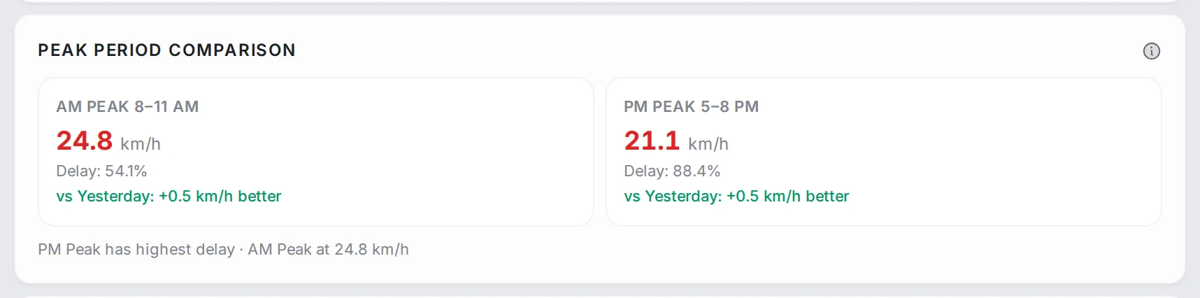
Peak Period Comparison: two cards side by side, for the morning peak (8–11 AM) and the evening peak (5–8 PM). Each shows the average speed, the delay and the change since yesterday, and a line underneath says which peak has the higher delay.
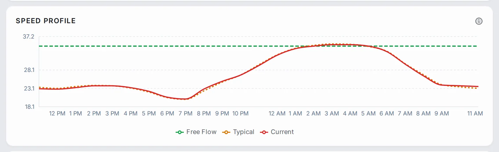
Speed Profile: three lines across 24 hours: Free Flow, the speed with no congestion; Typical, the historical average for this hour and day of the week; and Current, today’s speed. Hover any hour to read all three.
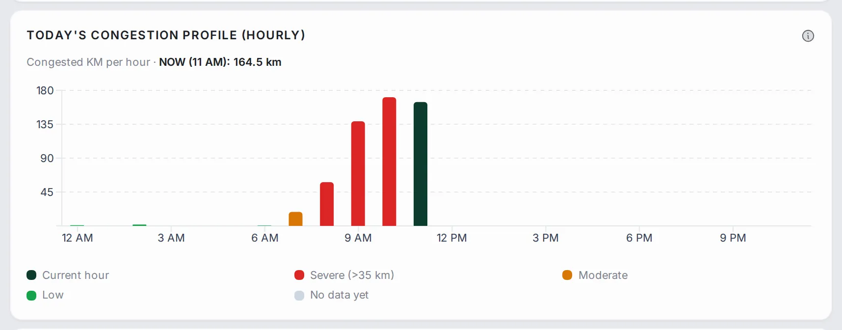
Today’s Congestion Profile (Hourly): one bar per hour for the length of congested road in that hour. The dark green bar is the current hour and the others are coloured by severity, so the shape of the day stands out at a glance.
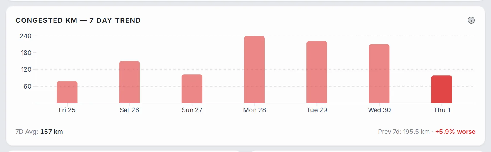
Congested KM — 7 Day Trend: one bar for each of the last 7 days, for the average congested length in the peak hours (7–9 AM and 5–7 PM), with the 7-day average set against the week before. Today is the darker bar. Use it to spot the trend and weekly patterns, such as lighter Sundays.
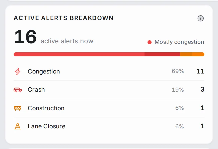
Active Alerts Breakdown: how many alerts are active on the network now, split by type: congestion and surge alerts from TraffiCure’s speed analysis, and incidents reported through Google, such as crashes, construction and lane closures.
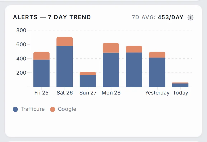
Alerts — 7 Day Trend: the total number of alerts for each of the last 7 days, split by source (TraffiCure and Google), with the daily average at the top. The last bar is today.
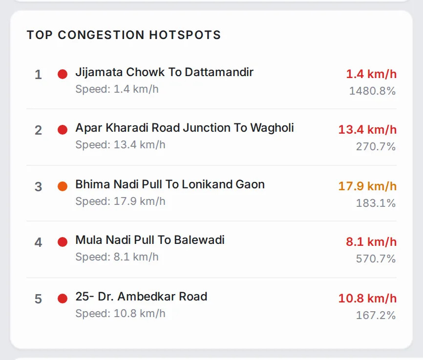
Top Congestion Hotspots: the roads with the highest delay right now. Each row shows the road name, its current speed and how much longer trips take than at free flow, as a percentage. Click a row to zoom the map to that road.
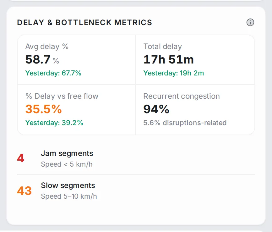
Delay & Bottleneck Metrics: the average delay, the total delay across the network and the delay against free flow, each with yesterday’s value, and the share of recurrent congestion (the same time and place every day) against congestion linked to disruptions. Below them, the number of jam segments (speed under 5 km/h) and slow segments (5–10 km/h).
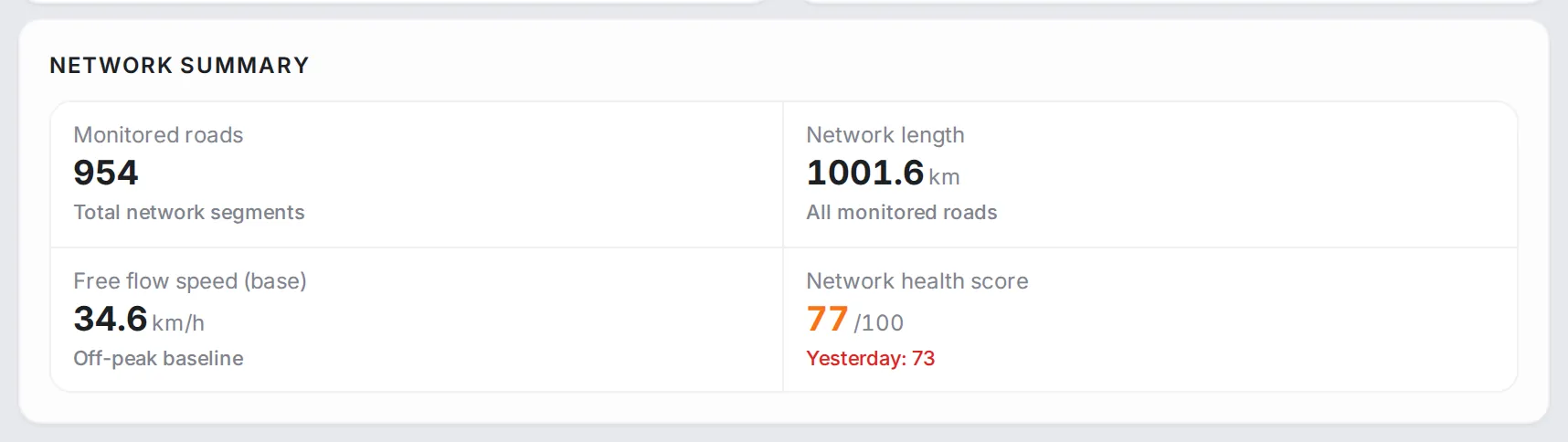
Network Summary: a reference card with the number of monitored roads, the network length, the free-flow speed baseline and the Network health score out of 100, with yesterday’s score. The score adds up three parts: how close travel times are to free flow (up to 50 points), the share of the network free of congestion (up to 30 points) and how complete the data is (up to 20 points).
Common workflows
- Morning check: open the page. The four headline numbers at the top and the network health score at the bottom tell you whether today is normal or unusual.
- Compare the peaks: read “Peak Period Comparison” to see which peak has the higher delay, then check “Speed Profile” for the shape of the day, hour by hour.
- City-wide or local? If congested km and the congestion index both rise, the problem is network-wide. If they stay in their usual range while “Top Congestion Hotspots” shows high delays, the problem sits on a few corridors.
- Drill into a hotspot: click its row in “Top Congestion Hotspots” to zoom the map to it, then open the road in Analytics for its whole day.
- Track an intervention: note the headline numbers before a project, come back a week later, and compare the changes and the 7-day bars to see whether it is working.
Who it’s for
- Traffic chiefs who need one screen that answers “how is the city moving today?”
- Transport planners comparing weeks and months to see whether interventions are working.
- Senior leadership following the network health score and the headline numbers without the detail.
Related modules
Spot a hotspot here, then open Analytics to read the road hour by hour. If the problem looks spatial rather than tied to one corridor, go to Area Analysis. To follow a specific trip over time, set up a route in Route Monitoring; for the same numbers in a regular report, see Reports.
The screen at a glance
The whole city on one screen: headline numbers, reliability, peaks, alerts and hotspots. Hover a number to find it on the screen.
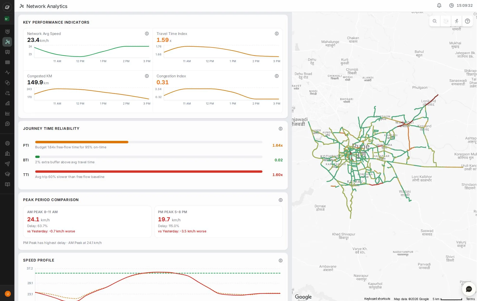
- 1Average speed, travel time index, congested km and congestion index, with today's curves
- 2Journey time reliability: PTI, BTI and TTI
- 3Morning against evening peak, compared with yesterday
- 4Network speed through the day. Scroll for alerts, hotspots and the health score
- 5Map of the network; click a hotspot to pin it
Step by step
Guides that walk you through this module in the live app, one click at a time.