
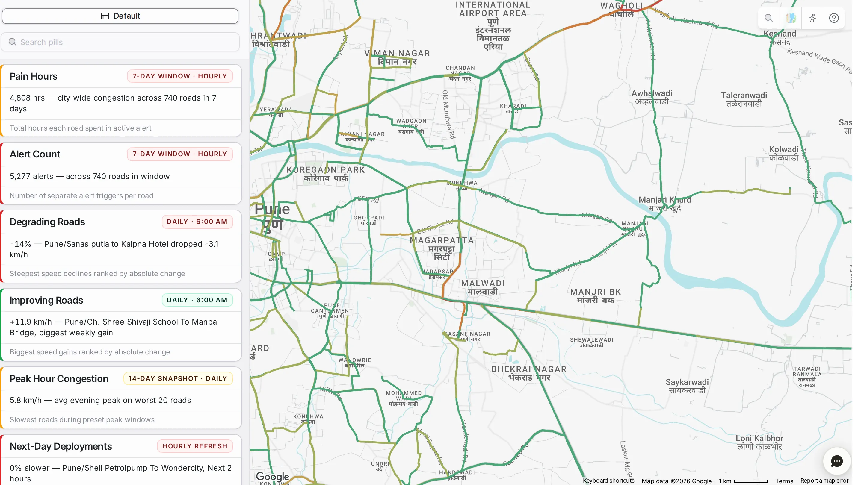
CityPulse turns your data into a set of cards, or widgets, each answering one question about the network, such as which roads are getting worse, how many alerts there were, how bad the peak hour is, or where to deploy staff tomorrow.
The cards
The “Default” tab holds the cards that come with the platform, refreshed automatically, and the “Search pills” box finds a card by name.

Each card shows its name, how often it refreshes and the period it covers (such as daily at a set time, hourly, or a 7- or 14-day window), a line with the current value, and a short description of what it measures. The colour of its left edge gives an instant read.
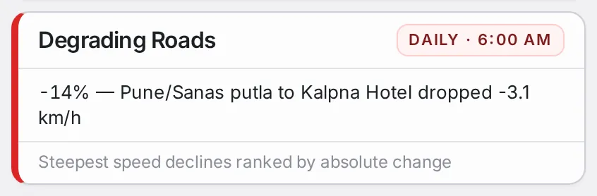
A card in detail
Click a card to open its detail panel, and the map colours the roads it covers. “Inbox” at the top left of the map takes you back to the list.
The top of the panel shows the card’s name and description, with an information icon that explains how it is worked out. Below it are the filters, such as the comparison period: the last 7, 14, 21 or 30 days, set against the same length of time before. The panel and the map update together when you change them.

The body of the panel is a set of blocks chosen for the card’s question, such as headline numbers at the top, a table of roads you can sort by any column, charts across the hours of the day, a breakdown by road class, or a short note on how to read the numbers.
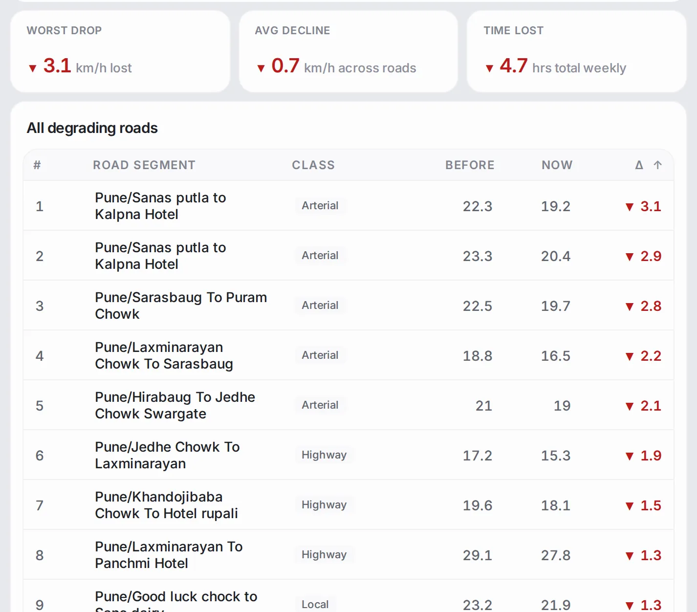
The map is part of the card: it colours the roads concerned in the card’s colours, and you can pan and zoom to see exactly where the numbers come from.
Common workflows
- Morning read: go through the default cards; the coloured edges tell you which ones to read first.
- Track roads that are getting worse: open “Degrading Roads”, change the period, and read the table for the biggest drops in speed and where they are on the map.
- Follow up on what a card shows: when a card flags something unusual, go to Analytics, Alerts or Area Analysis for the road-by-road or area-by-area picture.
Who it’s for
- Operations leads who want a daily read on one screen.
- Analysts following particular measures regularly.
- Decision-makers who want answers to specific questions without learning a new tool.
Related modules
CityPulse is the quick read; the deeper modules are where you act on what it shows. From any card, follow up in Analytics, Area Analysis or Alerts, or get the same numbers in regular Reports.
The screen at a glance
Ready-made views of your city: pain hours, roads getting better or worse, tomorrow's forecast and reported incidents. Hover a number to find it on the screen.
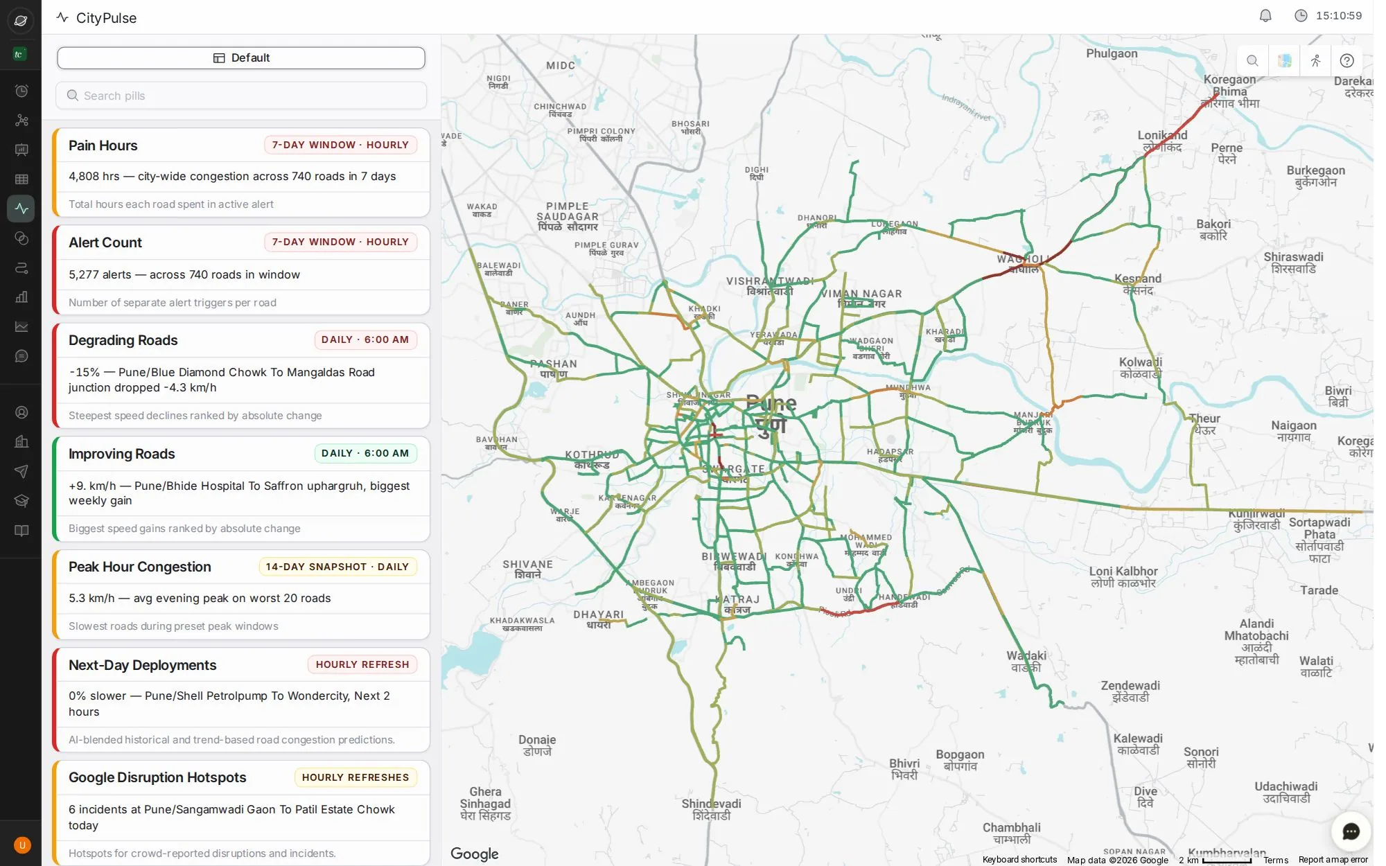
- 1Saved views
- 2Search the views
- 3Each card is one view; the tag says how often it refreshes
- 4Roads getting worse, and better
- 5Tomorrow's predicted worst roads
- 6Incidents reported by drivers on Google Maps
Step by step
Guides that walk you through this module in the live app, one click at a time.