
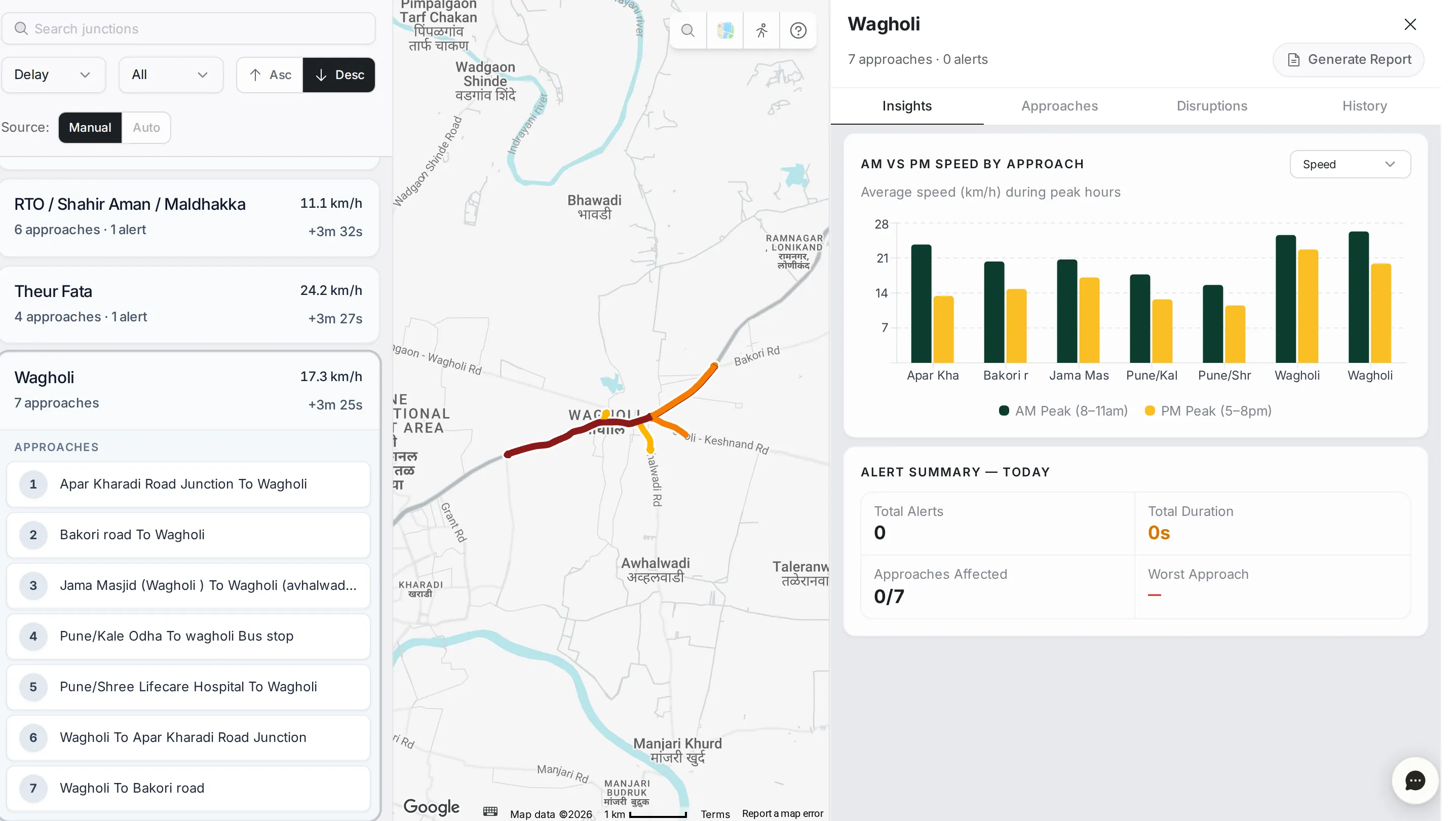
Junctions shows your network junction by junction. Each junction is split into its approaches, the roads that feed into it from each direction, so when it is slow you can see which approach is holding it up, and how it behaves through the day and the week.
The junction list
The list shows every junction, with its name, average speed, number of approaches, number of active alerts if there are any, and average delay.
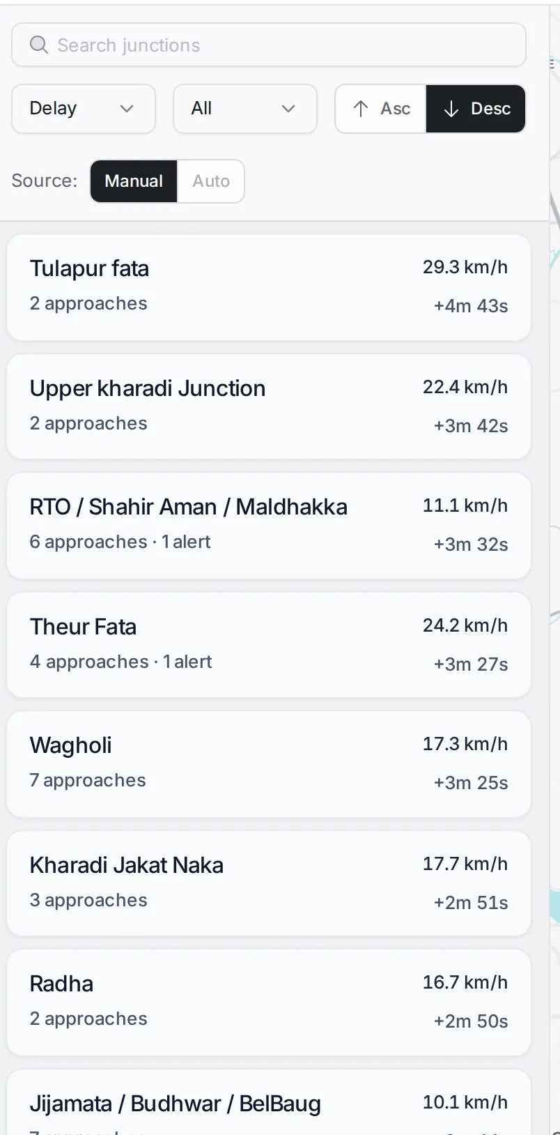
Above the list: the “Search junctions” box, the sort list (delay, speed, number of approaches, alerts or name), the count (the top 10, 20, 50 or 100, or all), the order buttons, and the “Source” switch (“Manual” or “Auto”) that chooses which set of junctions is shown.
Pick a junction in the list or on the map and its approaches open under it, and appear on the map coloured from green to red by delay.
Junction details
The detail panel shows the junction’s name, its number of approaches and active alerts, a “Generate Report” button, and four tabs: “Insights”, “Approaches”, “Disruptions” and “History”.
Insights tab
The default tab. It answers two questions at once.
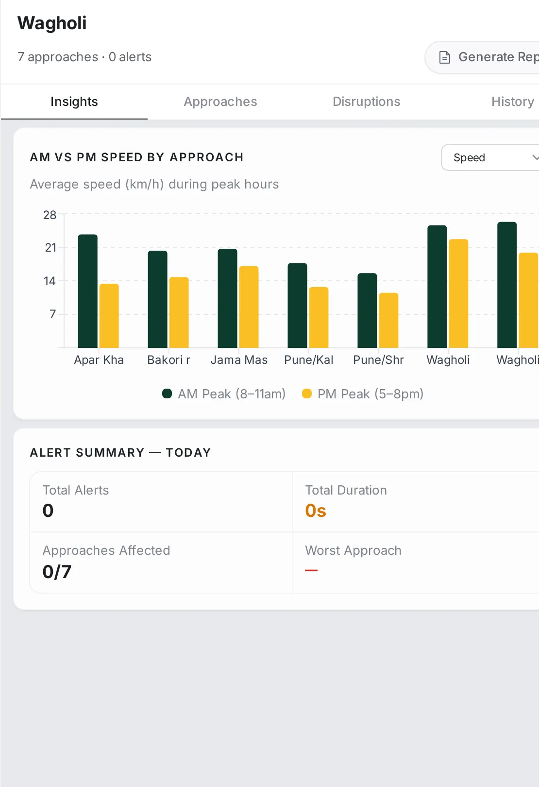
AM vs PM Speed by Approach: a grouped bar chart that compares each approach’s average speed in the morning peak (8–11 AM) with the evening peak (5–8 PM). The list at the top of the chart switches it to delay or delay %.
Alert Summary — Today: the total number of alerts on the junction today, their total duration, “Approaches Affected” and “Worst Approach”.
Approaches tab
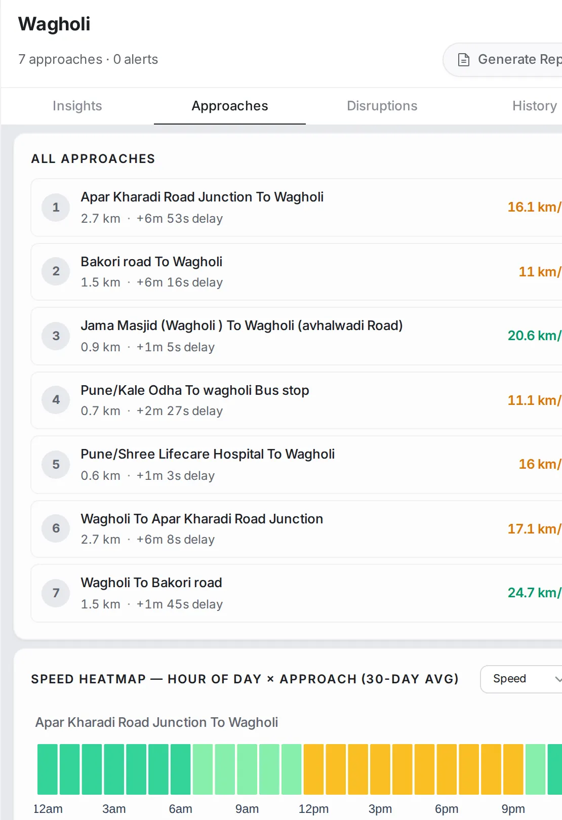
A list of all the junction’s approaches with the speed, length and delay of each, and under it a heat map of each approach across the hours of the day (30-day average): green where the approach usually flows, yellow to red where it slows down. The list above the heat map chooses the metric shown. Click an approach to open its details.
Disruptions tab
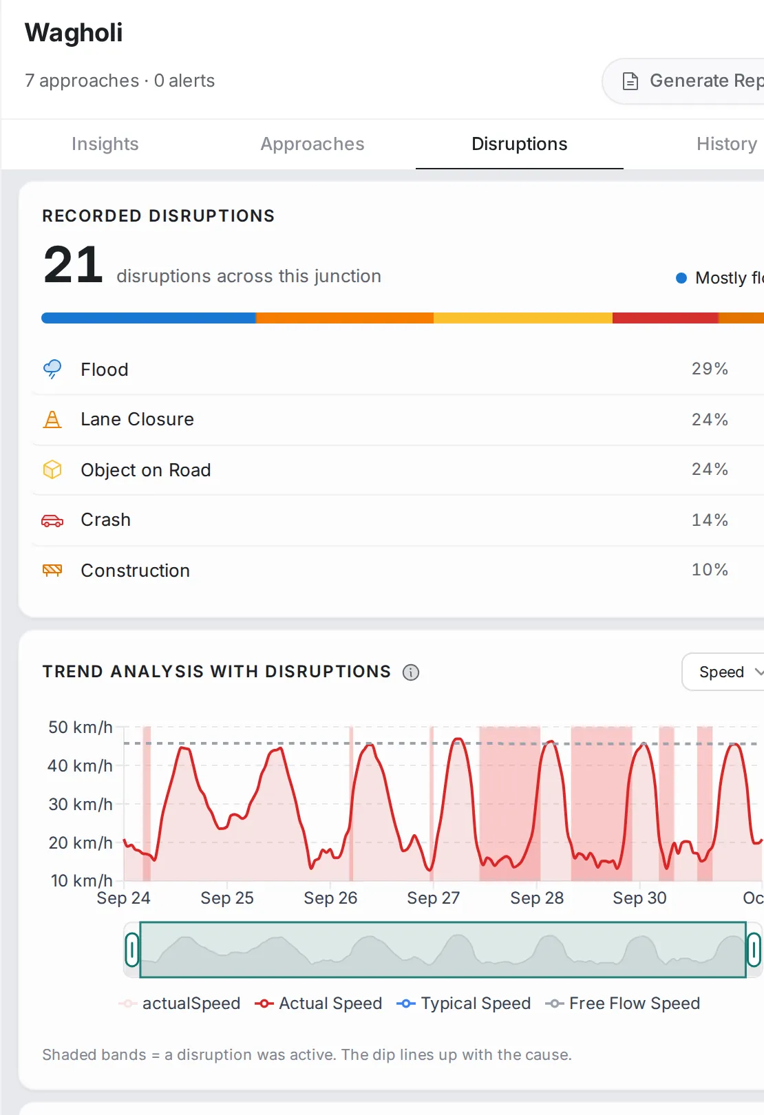
The disruptions recorded across this junction and their split by type (such as floods, lane closures, objects on the road, crashes and construction), with the speed chart shaded where disruptions were active.
History tab
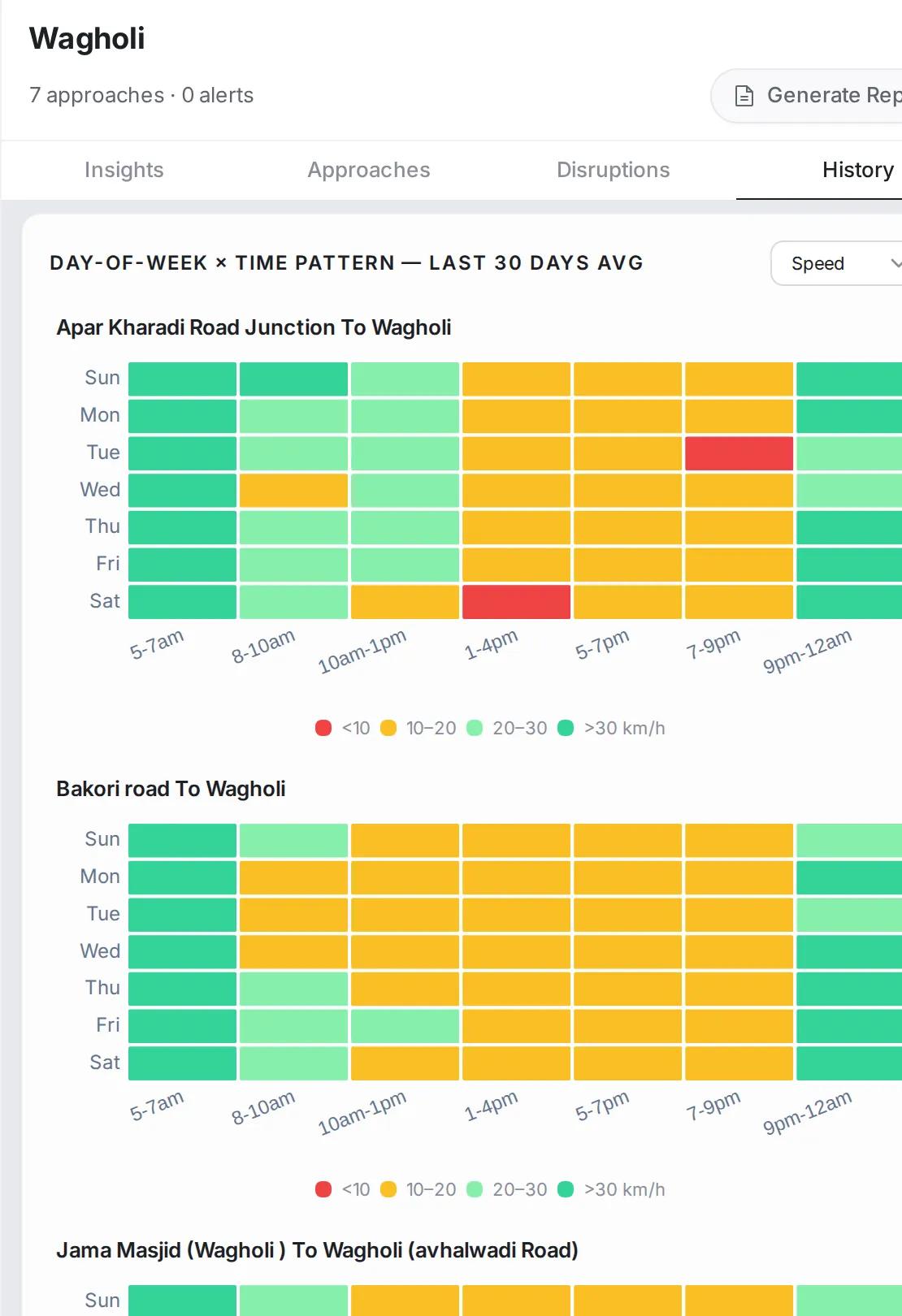
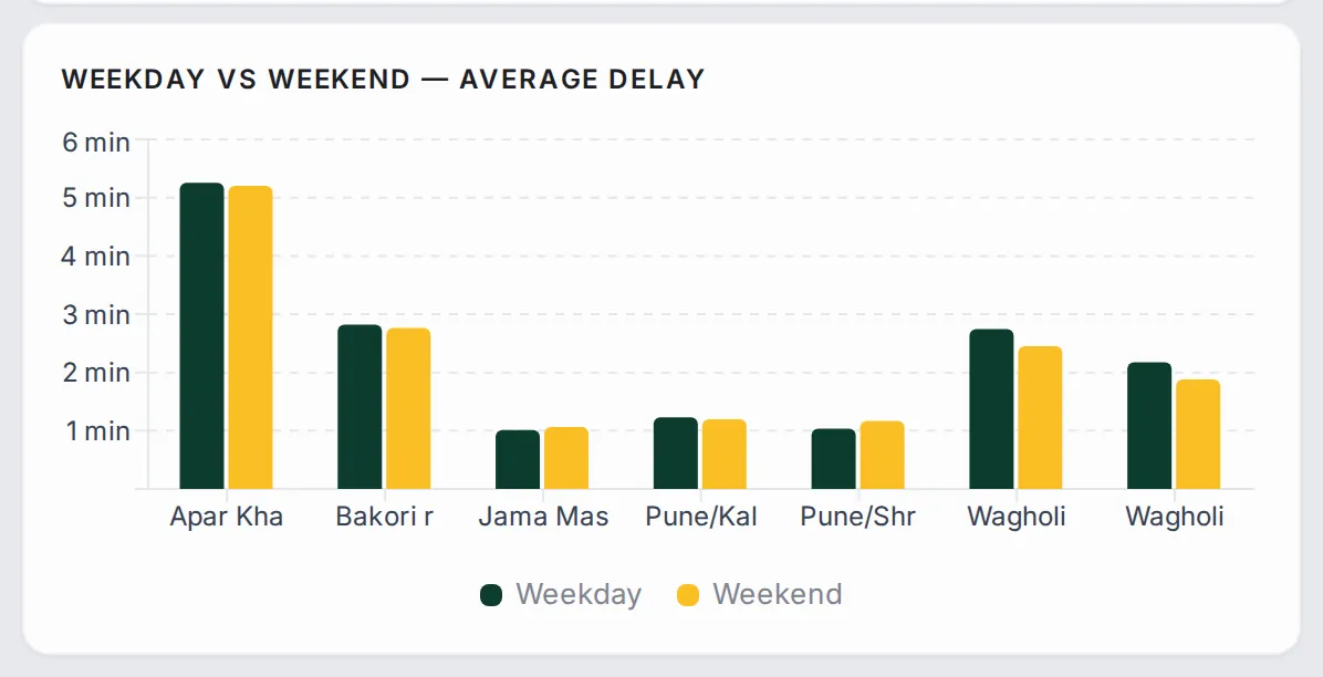
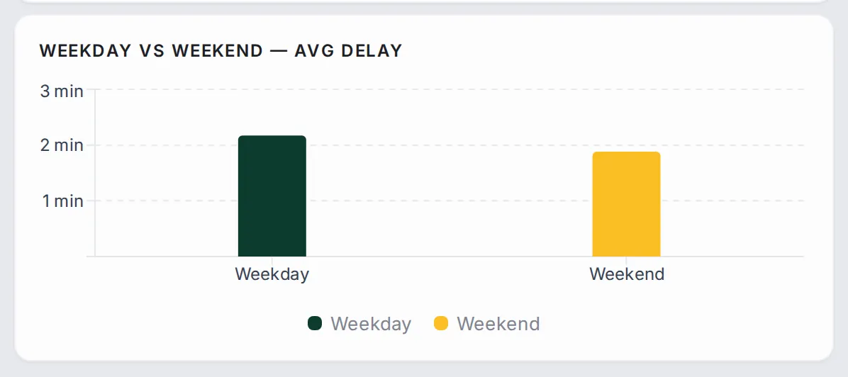
A look back over the last 30 days, in two views. Day-of-Week × Time Pattern for each approach: a row per day and a column per time block; a solid red band across the working days means a structural problem, scattered squares mean slowdowns tied to particular times. Weekday vs Weekend — Average Delay: each approach’s average delay on weekdays and at the weekend; if weekdays are much worse, the problem is commuting traffic; if the two are close, it is a permanent bottleneck.
Approach details
Click an approach and the panel switches to its details, with its name, the junction it feeds and a back arrow, and two tabs: “Insights” and “Disruptions”.
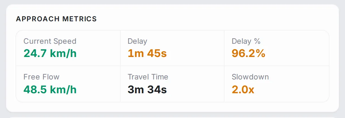
Approach Metrics: current speed, delay, delay %, free-flow speed, travel time, and slowdown (the congestion factor).
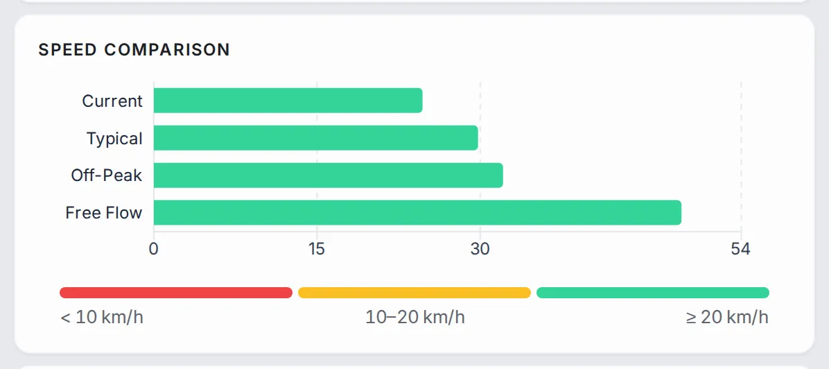
Speed Comparison: the current speed against the typical, off-peak and free-flow speeds, to see how far the approach is from its normal state.
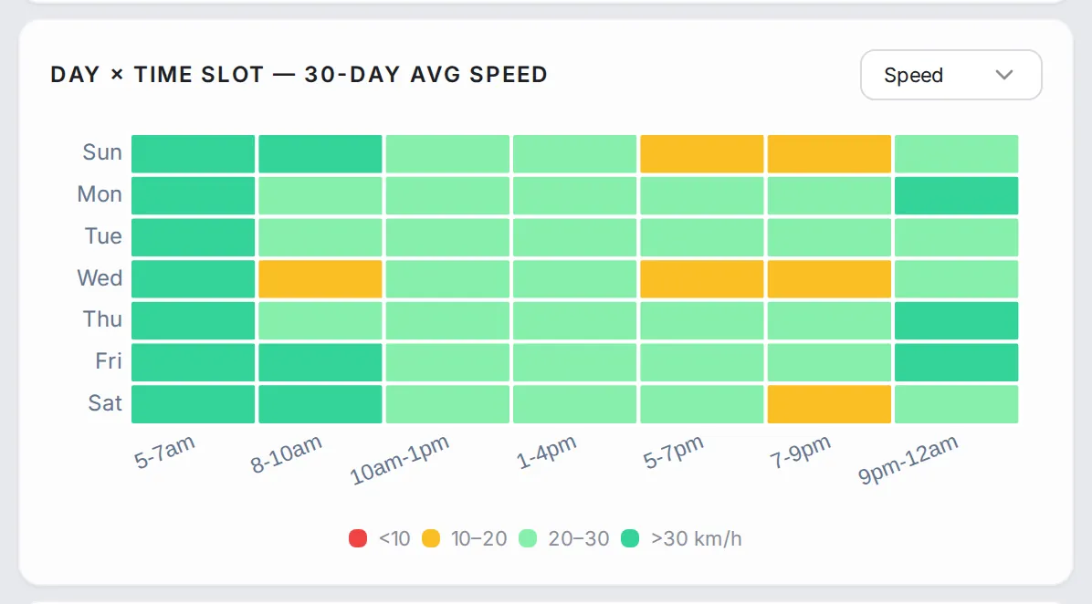
Day × Time Slot: the same heat map as in “History”, for this approach alone. Weekday vs Weekend — Avg Delay: this approach’s average delay on weekdays and at the weekend.
Common workflows
- Find the worst junctions now: sort the list by delay, descending, and read the first rows.
- Find where a junction’s problem comes from: open it and look at the AM vs PM chart; the shortest bar is the slowest approach in the harder peak.
- Retime the signals: open “Approaches” and read the heat map to see the hours when each approach slows down on a typical day.
- Tell a chronic problem from an occasional one: open “History”; solid red bands across the working days are chronic, scattered squares are tied to particular times of the week.
- Check whether a change worked: note the approach’s metrics and history before the work, then come back to the same screens after it.
Who it’s for
- Traffic engineers retiming signals or redesigning junctions.
- Operations teams separating chronic bottlenecks from one-off incidents.
- Planners measuring the effect of a junction change before and after.
Related modules
A slow junction usually means a slow road feeding it. Go to Analytics to read the slow approach road by road, to Alerts for what is happening at the junction right now, or to Route Monitoring to follow a route through it over time.
The screen at a glance
Every monitored junction, scored from the roads that lead into it. Hover a number to find it on the screen.
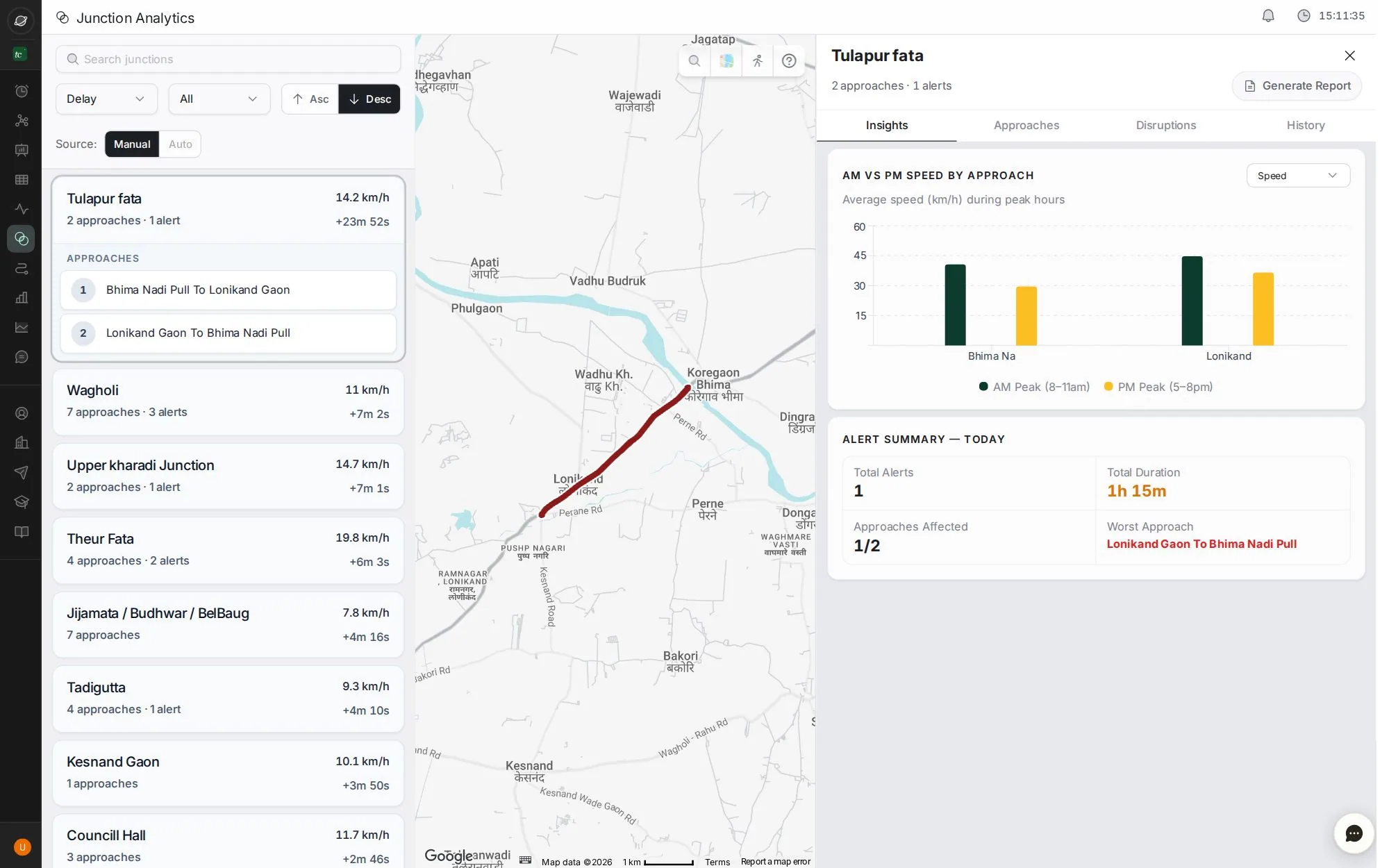
- 1Search junctions
- 2Sort by delay, speed or name; filter
- 3A junction and its approaches
- 4Insights, Approaches, Disruptions and History
- 5Morning against evening speed, approach by approach
- 6Generate a junction report
Step by step
Guides that walk you through this module in the live app, one click at a time.