
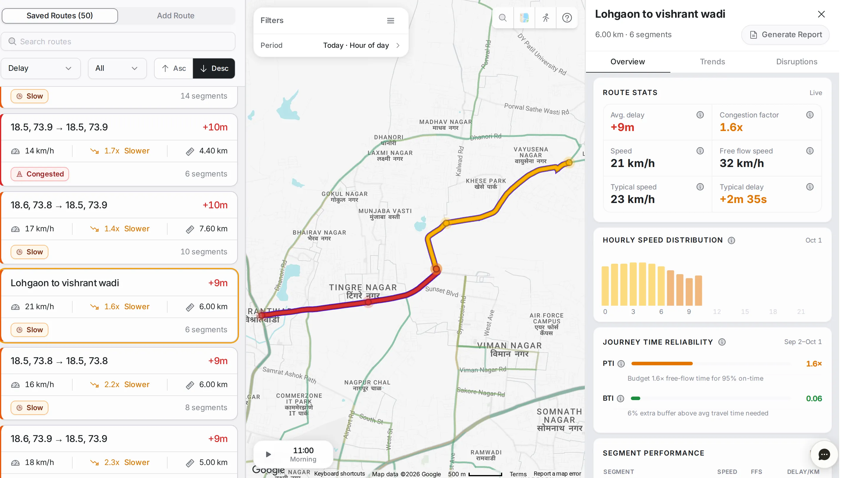
Route Monitoring lets you stitch single roads into the routes your city actually cares about, such as VIP routes, ambulance paths, school runs, daily commutes and delivery loops, and track each one as a whole: travel time, delay, reliability, live status and how every road in it is doing.
Saved routes
The list has two tabs: “Saved Routes” (with a count) and “Add Route”. The first lists every route saved in the workspace.
Each card shows the route’s name, its current delay, and three numbers: current speed, how many times slower than free flow it is (such as “1.7x Slower”) and the route’s length. At the bottom are the route’s status (such as “Slow” or “Congested”) and its number of segments, with a coloured left edge for an instant read.
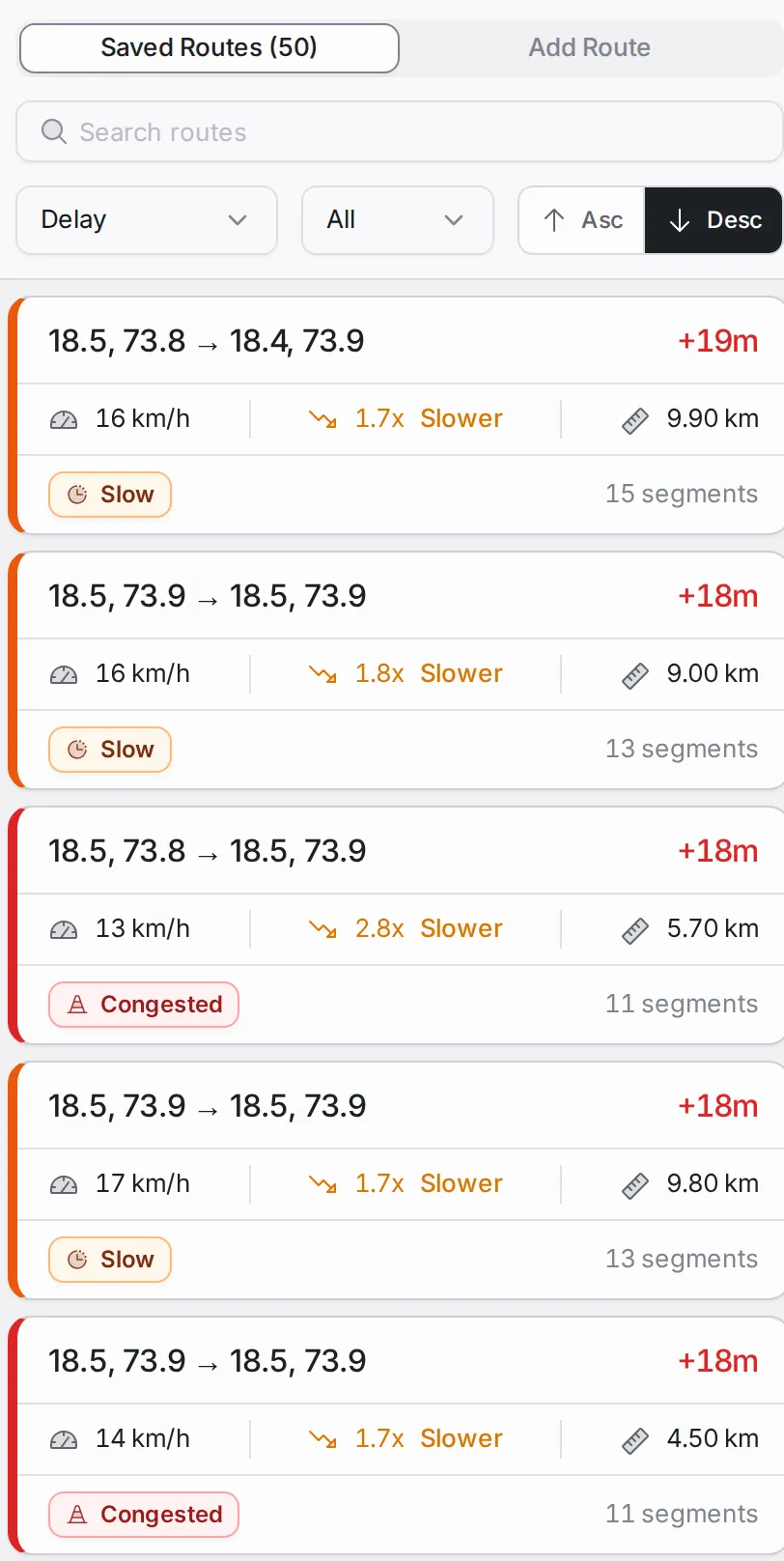
Above the list: the “Search routes” box, the sort list (delay, speed or name), the count (the top 10, 20 or 50, or all) and the order buttons.
Creating a route
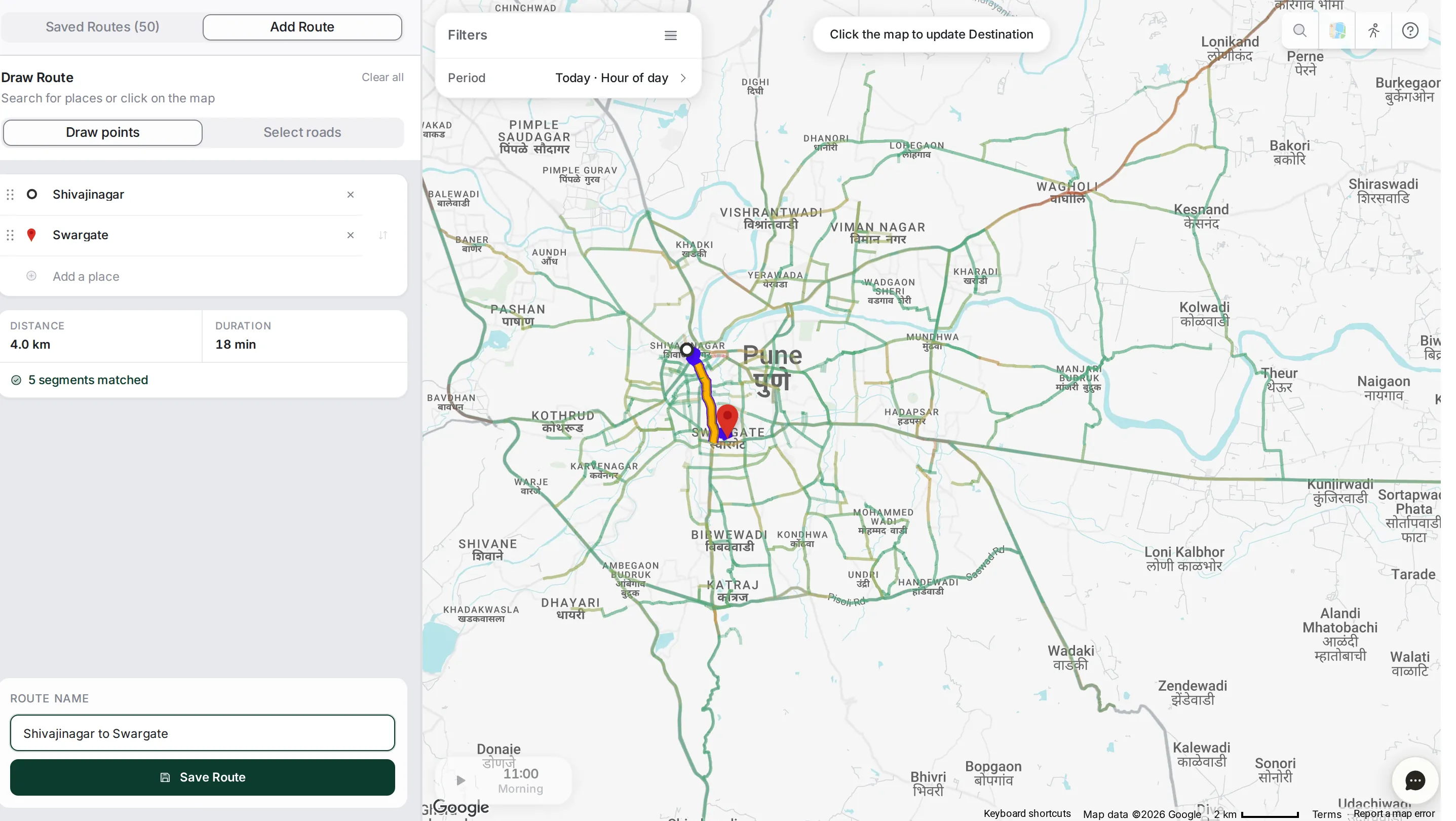
Open the “Add Route” tab and the “Draw Route” panel appears.
Add the route’s points in one of two ways: search for a place by name, or click straight on the map. Each point drops a pin on the map; TraffiCure matches the path between them to the real road network, and shows the distance, the duration and how many segments it matched. Add more points with “Add a place”, and choose at the top of the panel between “Draw points” and “Select roads”.
Once the route is matched, type its name under “Route name” (for example “Shivajinagar to Swargate”), then click “Save Route”.
Route details
Click a route to open its detail panel, with its length and number of segments, a “Generate Report” button, and three tabs: “Overview”, “Trends” and “Disruptions”.
Overview tab
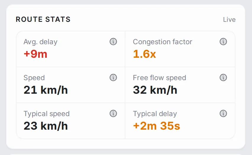
Route stats: the average delay, the congestion factor (1.6x means the trip takes 1.6 times as long as at free flow), the current speed, the free-flow speed, the typical speed and the typical delay.
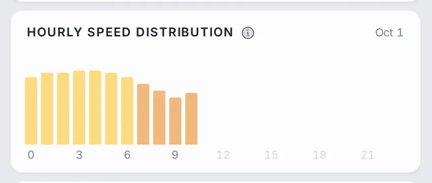
Hourly Speed Distribution: the route’s speed through the day; the dips show when it slows down.
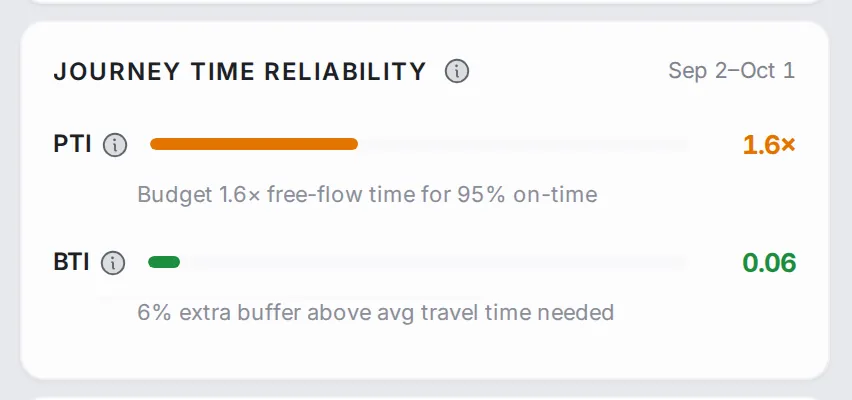
Journey Time Reliability: the PTI and BTI of the route over the last 30 days (the dates show at the top right of the panel), each with a bar and a line that explains it.
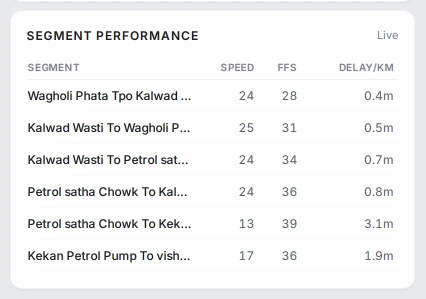
Segment Performance: a row for each road in the route, with its speed, free-flow speed (FFS) and delay per kilometre.
Trends tab
This tab shows the route over a longer stretch of time, rather than right now.
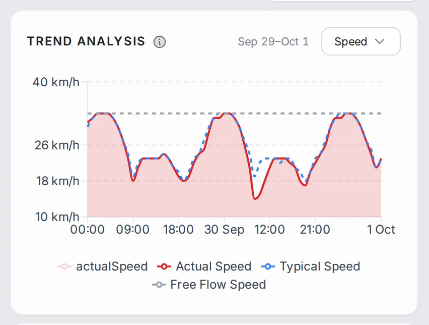
Trend analysis: actual speed against typical and free-flow speed over the last few days, with a choice of metric: speed or delay. It is the quickest way to see whether a route is getting worse or holding steady.
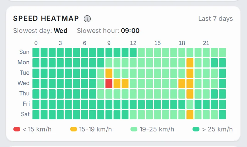
Speed heatmap: the route’s speed by day of the week and hour of the day over the last 7 days, with the slowest day and slowest hour called out. It shows whether the route’s slow spells come back every day, only on working days, or now and then.
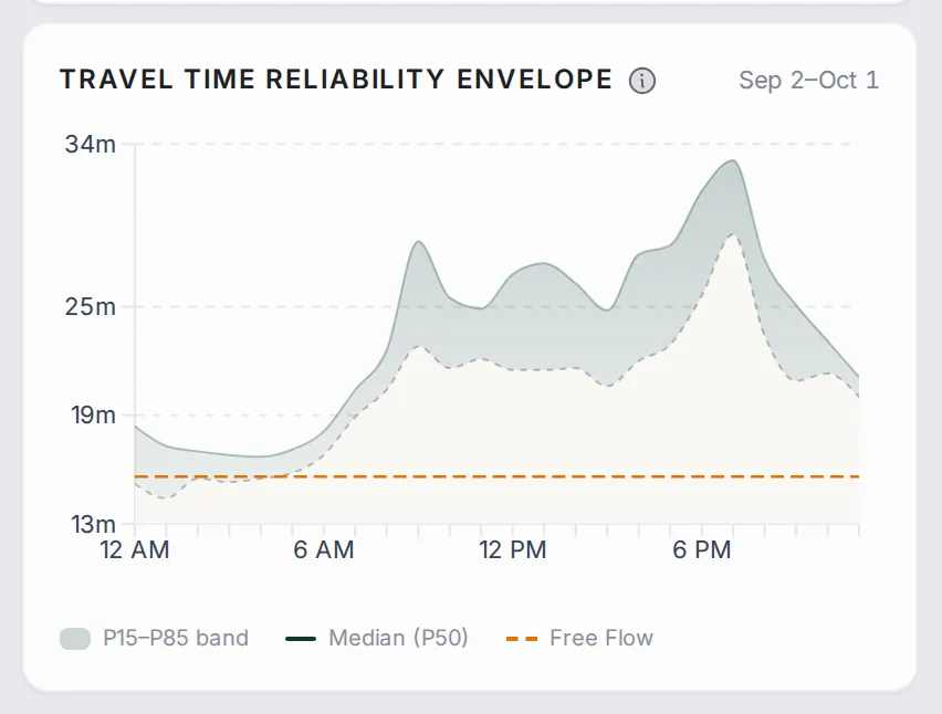
Travel Time Reliability Envelope: how travel time varies through the day over the last month: the band between the 15th and 85th percentiles, the median (P50) and the free-flow travel time. A wide band means a route you cannot predict; a narrow one means a route you can count on.
Disruptions tab
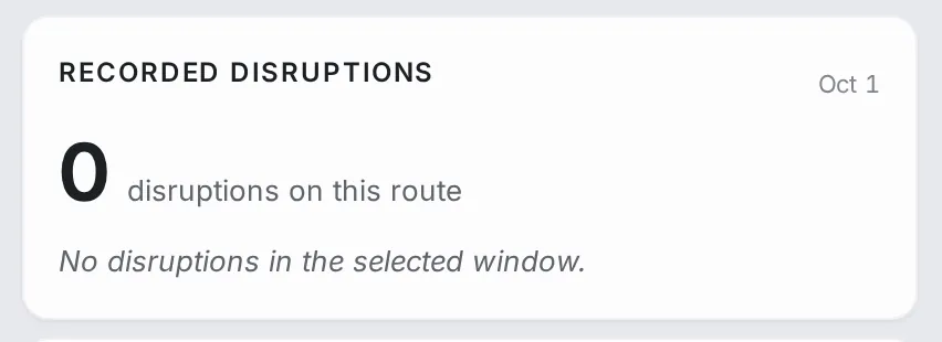
The disruptions reported on the route’s roads in the chosen period.
Period and playback
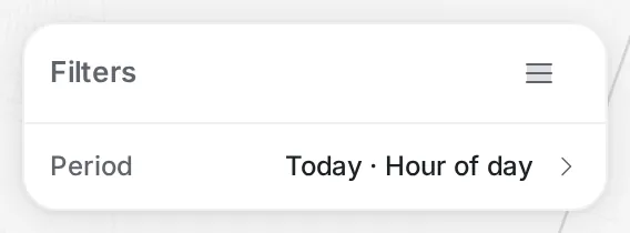
The “Filters” panel at the top of the map sets the period (“Today · Hour of day” to start with), and the time control at the bottom of the map shows the chosen hour. Click the hour to open the hour bar and jump to any hour, or press play to step through the hours; as it plays, the route’s colours on the map and the numbers in the detail panel change with each hour. At the current hour the stats are live; at an earlier hour they show that hour.
Common workflows
- Monitor a daily trip: add a route from home to work, save it, and check it each morning before you set off.
- Watch a critical corridor: set up routes for VIP movements, ambulance paths or school runs, and sort the list by delay so the worst stays on top.
- Choose when to set off: open the route, read “Hourly Speed Distribution”, and pick the hour when the dips end.
- Find the slow stretch: when a route slows down, open it and read “Segment Performance”; the road with the highest delay is the bottleneck.
- Check a road project: note the route’s stats before the work, come back after it, and look at “Trends” to see whether travel time really improved.
Who it’s for
- Operations teams watching the routes that matter: VIP movements, emergency paths and key commutes.
- Logistics planners tracking delivery routes and setting realistic arrival times.
- Project owners measuring whether a road improvement actually shortened a trip.
Related modules
A slow route usually means a slow road. Open Analytics for the slowest segment’s whole day, or check Alerts for alerts on it. To see whether the problem is area-wide rather than tied to the corridor, go to Area Analysis.
The screen at a glance
Routes your team tracks, with live speed, delay, reliability and a stretch-by-stretch breakdown. Hover a number to find it on the screen.
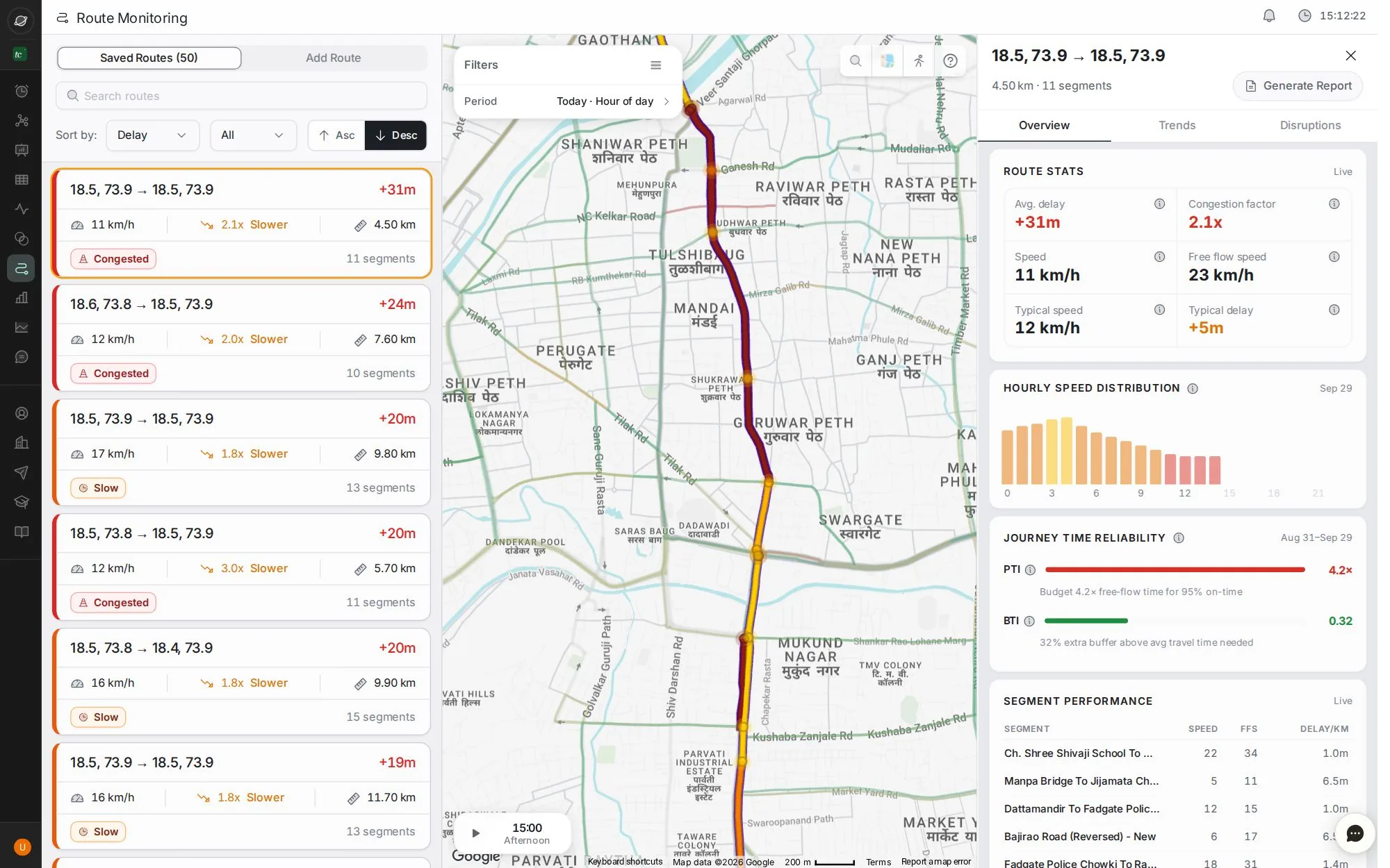
- 1Saved routes, or add a new one
- 2Search and sort routes
- 3A route: delay, speed, how much slower, length and status
- 4Time travel: scrub or play the day
- 5Overview, Trends and Disruptions
- 6Route stats: delay, congestion factor, speed, free-flow and typical
- 7Generate a route report
Step by step
Guides that walk you through this module in the live app, one click at a time.