
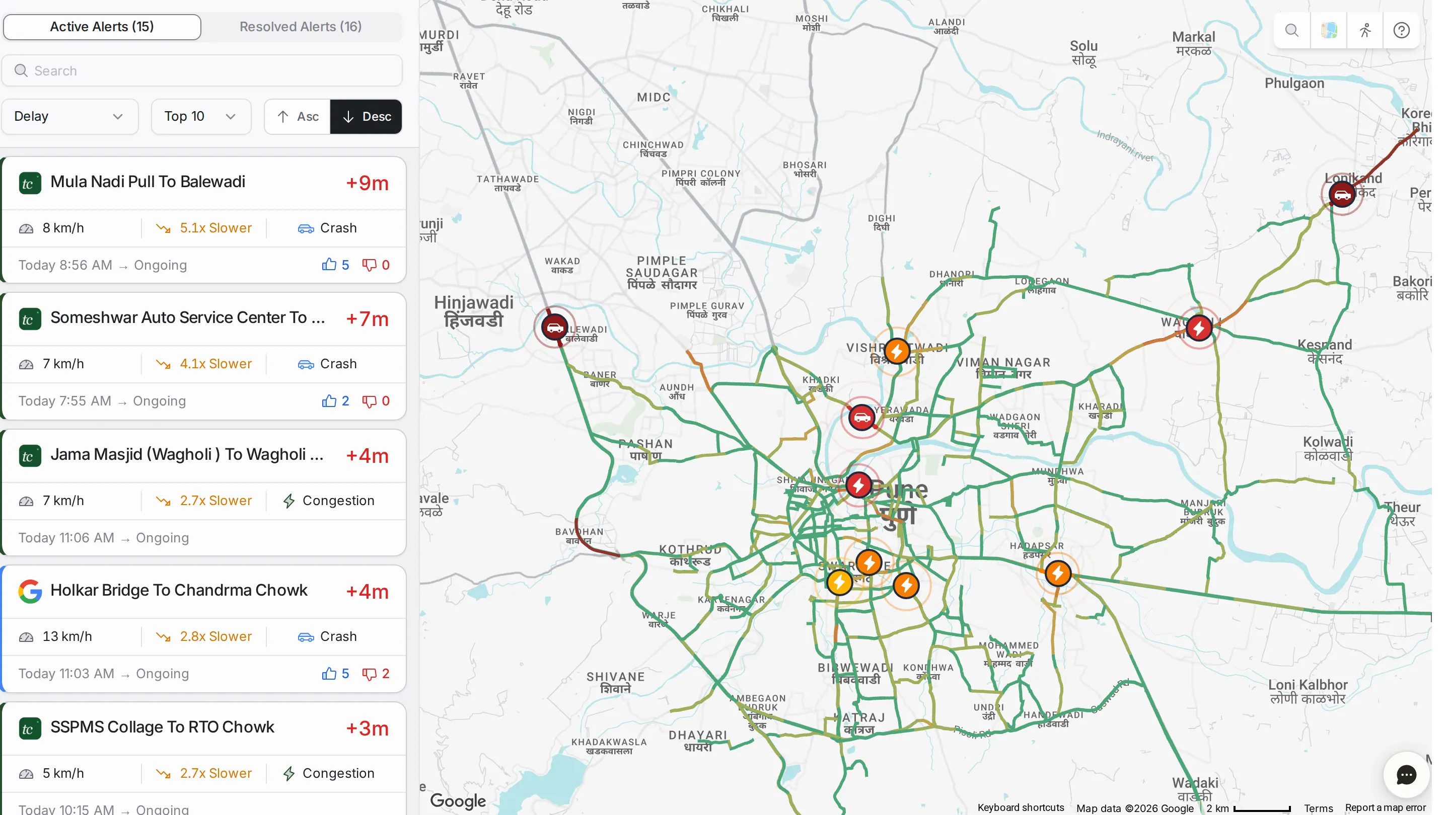
Active and resolved alerts
The page has a list on the left and a live traffic map on the right. The map shows your whole road network coloured by delay: green for free flow, yellow for moderate delay and red for heavy delay. Each active alert sits on top as a marker.
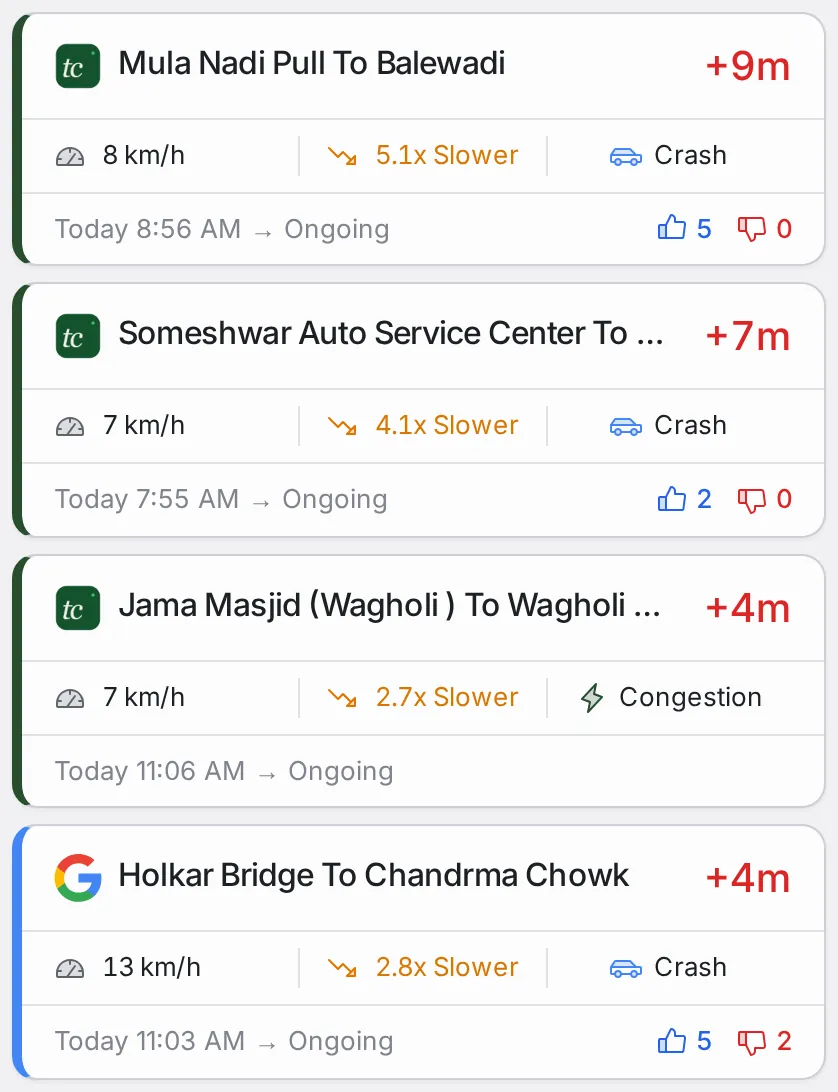
TraffiCure raises congestion and surge alerts from speed data, and adds incidents reported through Google, such as crashes and construction. The logo on each card shows where the alert came from: TraffiCure or Google.
The list has two tabs:
Active Alerts: what is happening now. Each alert shows the road name, the delay, the current speed, how many times slower than usual the road is (its congestion factor, such as “5.1x Slower”), the cause, the start time and the votes.
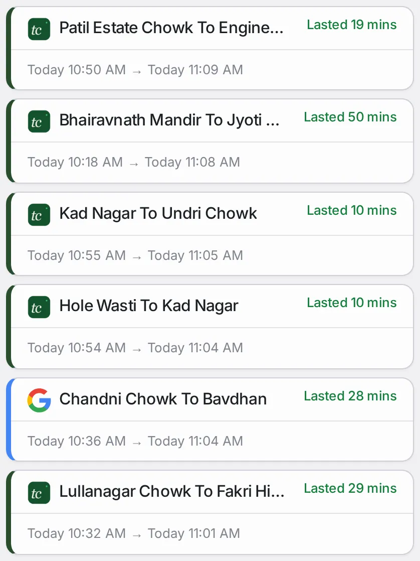
Resolved Alerts: alerts that have ended. Each shows the road name, how long it lasted, and its start and end times.
Filters and sorting
Each tab has its own filter and sort bar above the list, plus a search box that filters alerts by road name or location.
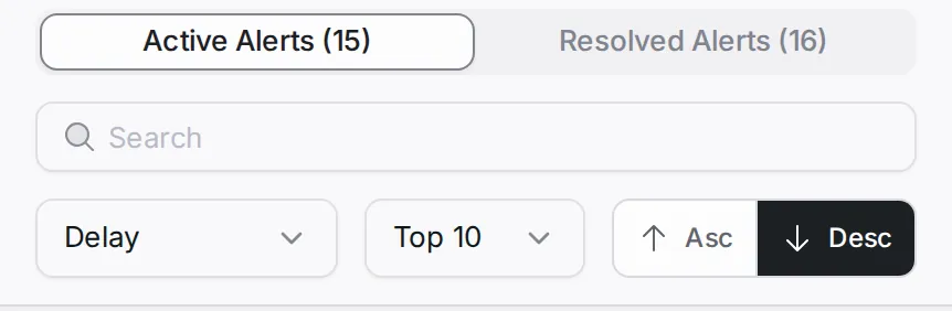
- Tab: Active Alerts or Resolved Alerts.
- Sort: on the active tab by delay, duration, start time or votes; on the resolved tab by end time, duration or start time. Either way ascending or descending, with “Asc” and “Desc”.
- Count (active tab): the top 10, 20, 50 or 100, or all.
- Search: road name or location.
- Time range (resolved tab): the last 20 minutes, hour, 6 hours, day or 2 days.
Opening an alert
Click any alert in the list, or its marker on the map, to open its detail panel. The map zooms to the affected road and the panel opens on the right.
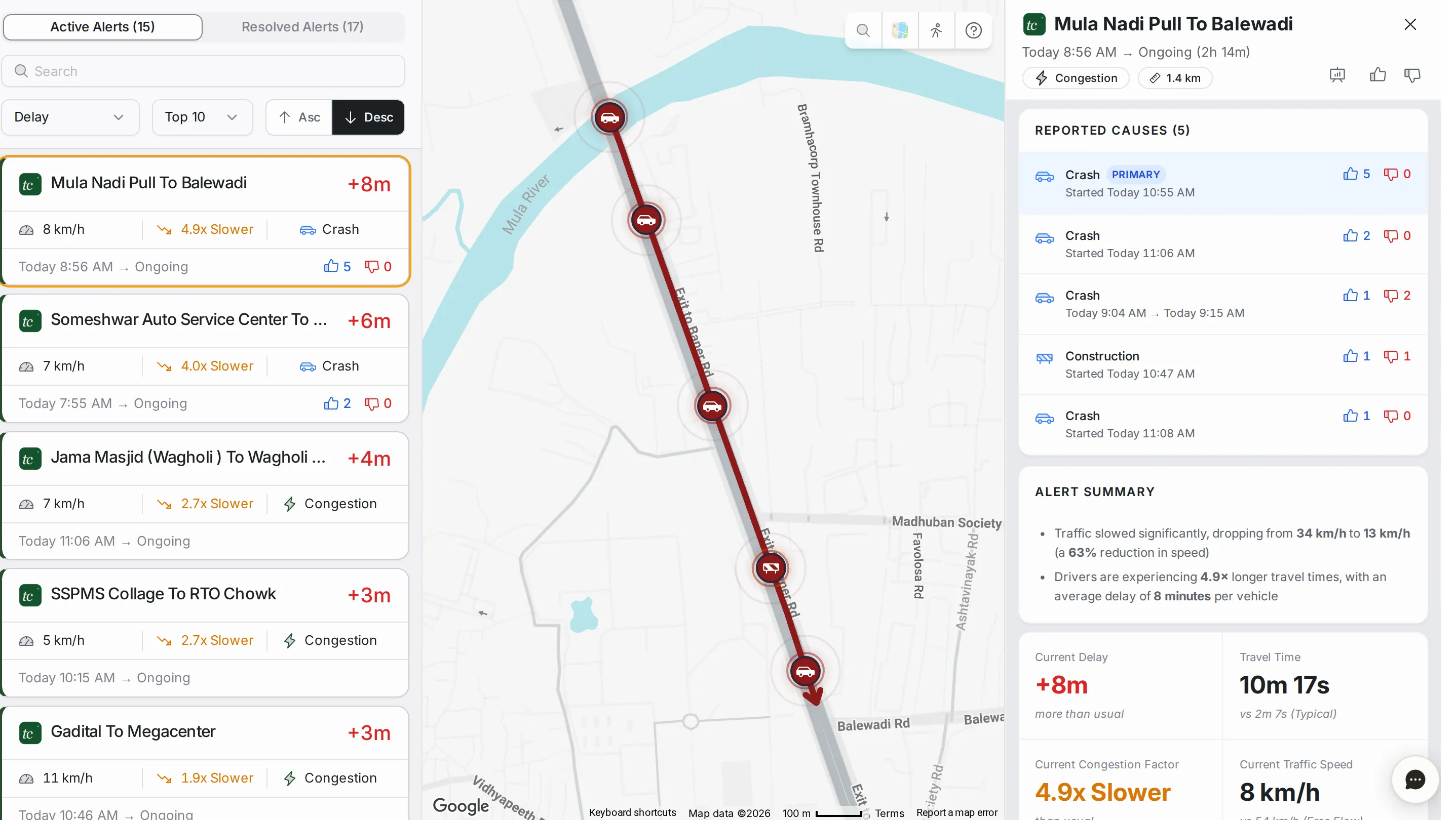
The top of the panel shows the road name, the start time and duration, the alert type and the segment length, with three buttons: “View segment analytics” opens the road in Analytics, and thumbs up (“Good alert”) or thumbs down (“Dismiss alert”) rates the alert. Below the header, Alert Summary sums up what happened on the road in two lines of numbers.
Reported Causes: when drivers have reported on Google Maps what is behind the slowdown, such as a crash, construction or a lane closure, the causes are listed above the summary, each with its start time and votes. Primary marks the most likely one. No causes listed means plain congestion.
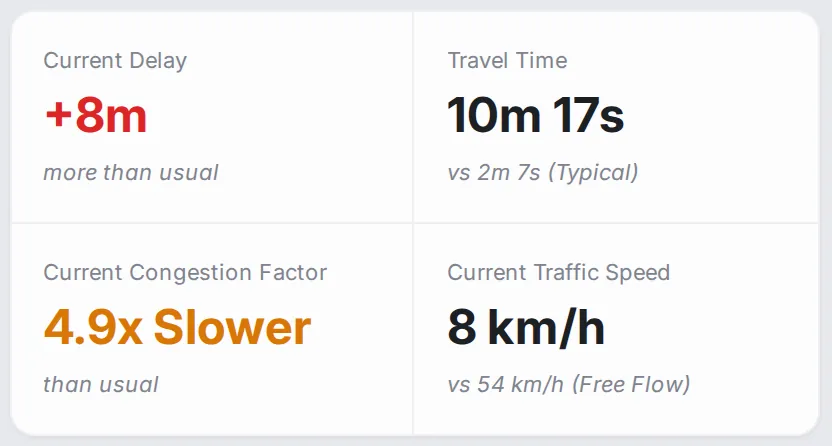
Summary stats: the current delay, the travel time against the typical time, the current congestion factor, and the current speed against free flow, for this alert alone.
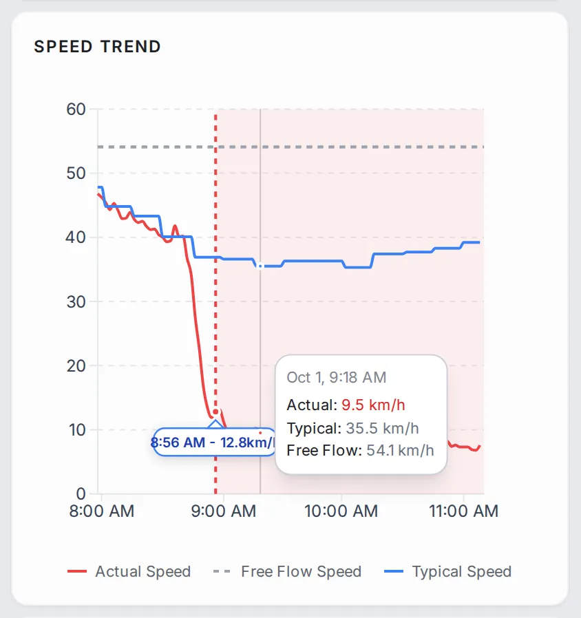
Speed Trend: the speed on the affected segment from shortly before the alert started until it ended (or until now, for active alerts), against the typical speed and the free-flow speed, with the alert window shaded. Hover the chart to read the values.
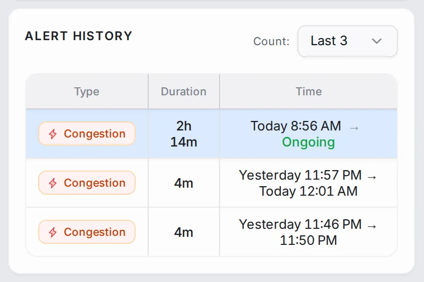
Alert History: earlier alerts on the same road segment (choose how many under “Count”), so you can tell a one-off from a chronic problem.
Common workflows
- Decide what to handle first: sort the list by delay, descending, read the alerts at the top, and click one to fly the map to it and open its detail panel.
- Dig into the affected road: in the alert’s detail panel, click “View segment analytics” to open the road in Analytics and read its history.
- Check when an alert ended: switch to “Resolved Alerts”, search for the road, and read the duration and end time.
- Share an active alert: copy the alert’s address from your browser. The link opens the same alert, with its current status and history, for any TraffiCure user you send it to.
- Make alerts better: rate an alert with thumbs up or thumbs down. The votes show on the card, and you can sort the list by them.
Who it’s for
- Control-room operators setting the day’s priorities and dispatching field teams.
- Field dispatchers picking faster routes around active alerts.
- Transport planners building the case for which corridors need the next intervention.
Related modules
After spotting a hotspot here, switch to Analytics for a deeper look at how the congestion developed, or to Area Analysis to see whether it is part of a wider pattern.
The screen at a glance
Every road that is slower than normal right now, worst first. Hover a number to find it on the screen.
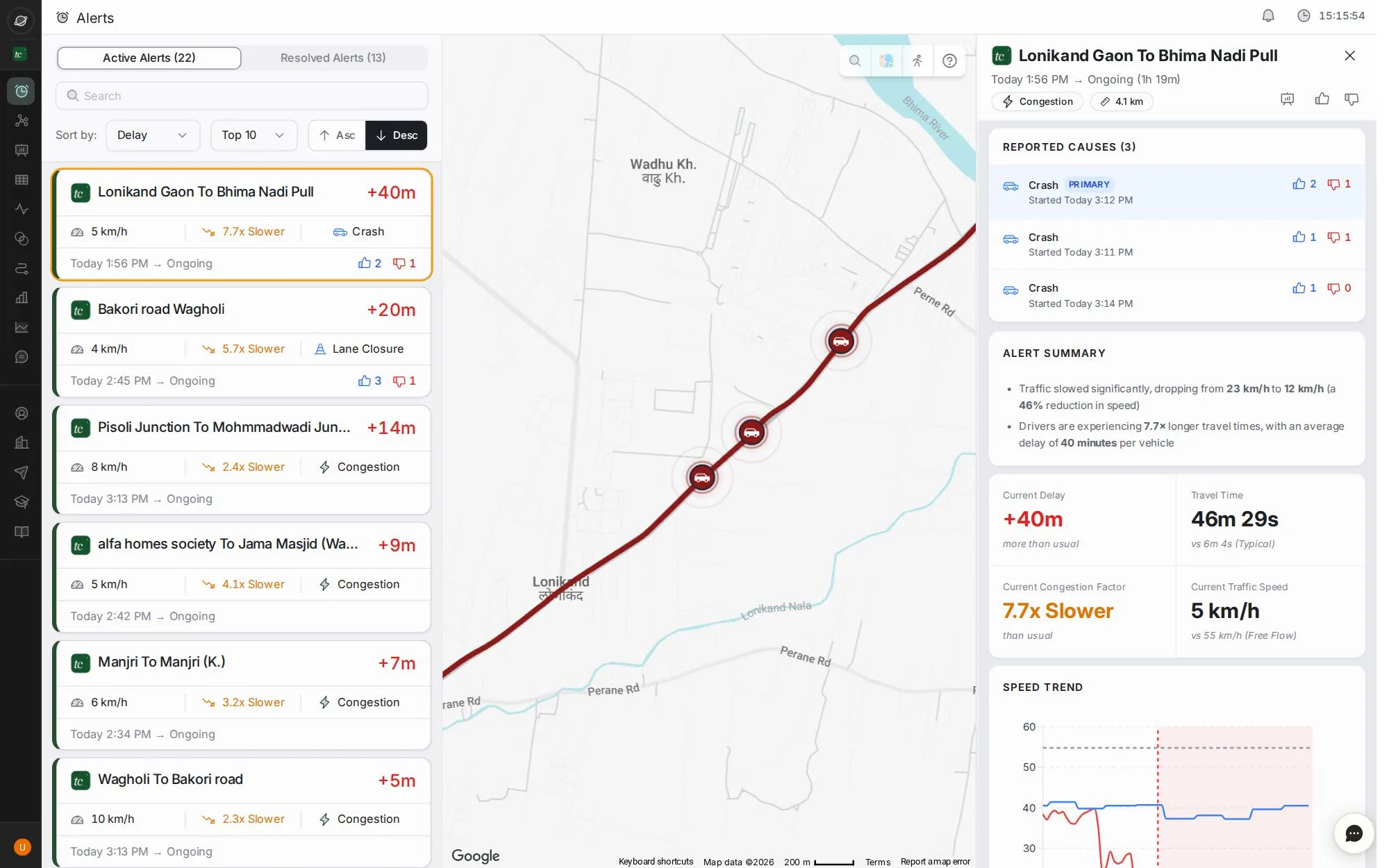
- 1Active and resolved alerts
- 2Search, sort (delay, duration, start time, votes), top N and order
- 3Each alert: road, delay, speed, how much slower, cause, start time and votes
- 4Search a place · map style · Street View · replay the tour
- 5Open the road in Analytics · thumbs up sharpens alerts · thumbs down dismisses
- 6Causes reported by drivers, with their votes
- 7Summary, delay, travel time, congestion factor and speed
- 8Ask the assistant about the alert you have open
Step by step
Guides that walk you through this module in the live app, one click at a time.