
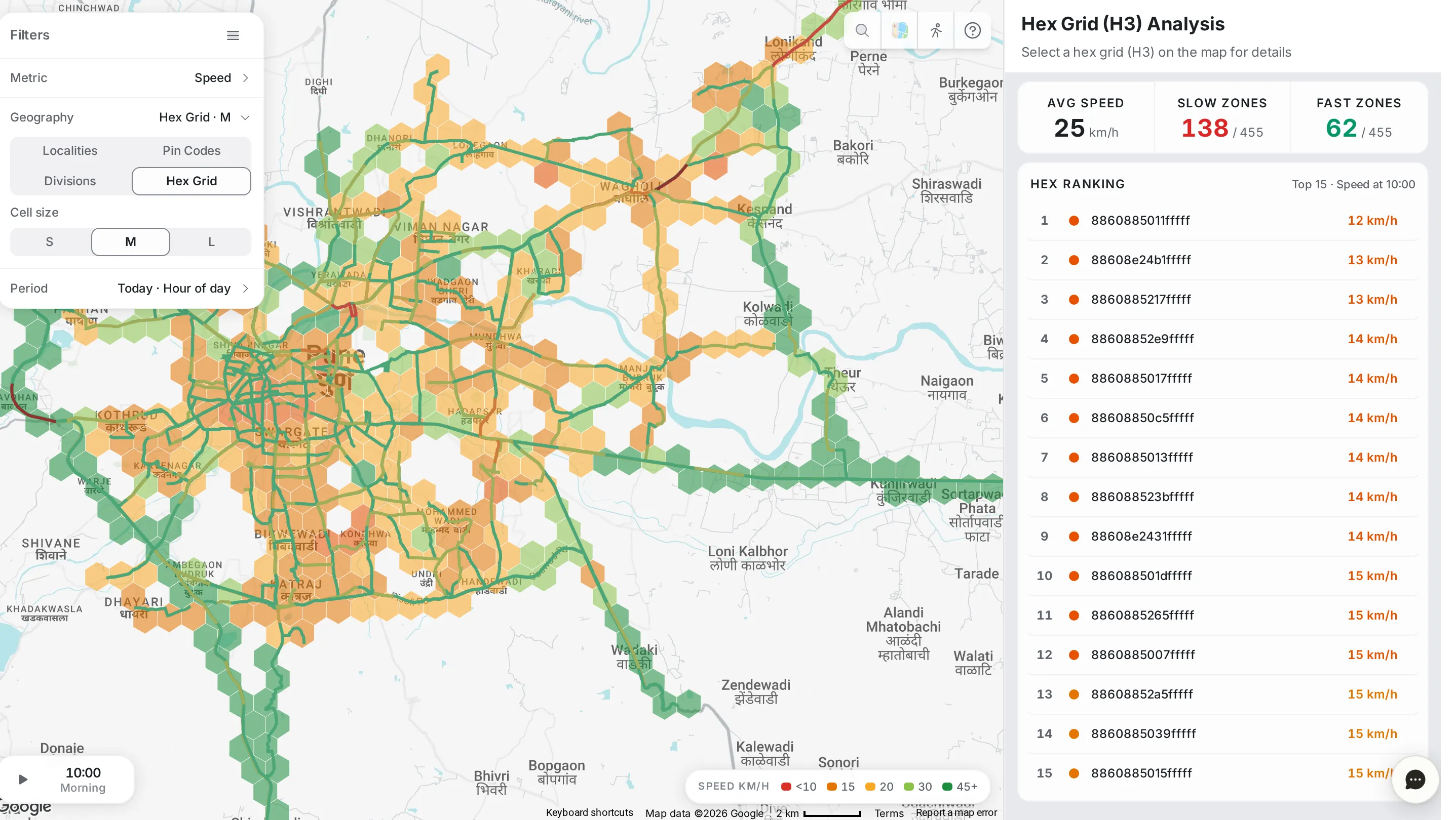
Area Analysis looks at the network by place: instead of asking “which road?”, you ask “which area?”. Choose the metric to compare, how to divide the city and the period, and the page does three things at once:
- Colours the map area by area, so the worst areas stand out at a glance.
- Ranks the top 15 areas in the side panel.
- Lets you step through the hours of the day, or play the whole day as an animation, and open any area to read its day.
Filters
The “Filters” panel at the top left of the map sets the whole view. It has three rows; click a row to open it.
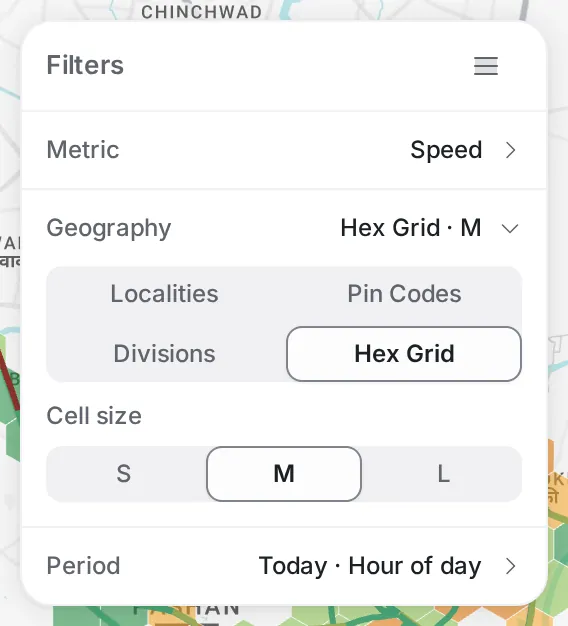
Metric: what the colour shows.
- Speed: the average speed of the roads in the area.
- Congestion: the share of the area’s roads that are congested.
- Delay: how much longer trips take in the area than at free flow, as a percentage (delay %).
- Disruptions: the number of disruptions reported in the area, which you can narrow to one type: crash, flood, fog, construction, lane closure, object on the road or stalled vehicle.
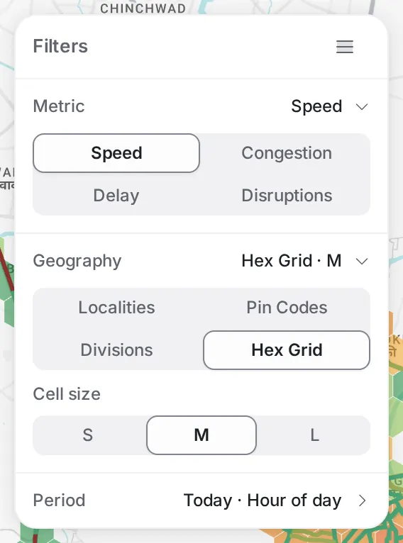
Geography: how the city is divided: “Localities”, “Pin Codes”, “Divisions” or “Hex Grid” (H3, equal-sized hexagons). For the hex grid, pick the cell size: S, M or L. Small cells show detail; large cells give the broader picture.
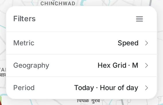
Period: a day, a week or a month; the day itself (today, yesterday or one of the days before); and whether to break it down by hour of day or show the whole period.
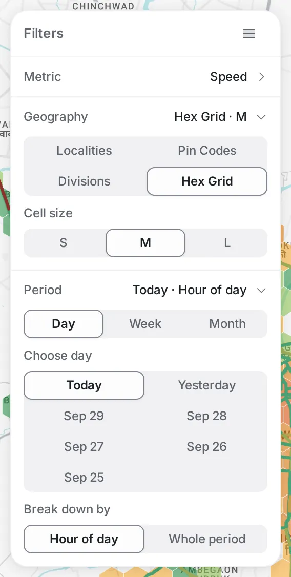
The map, the ranking and the colour key at the bottom right of the map update whenever you change one of these rows.
City summary
With no area selected, the side panel gives a reading for the whole city, for the chosen metric and hour.
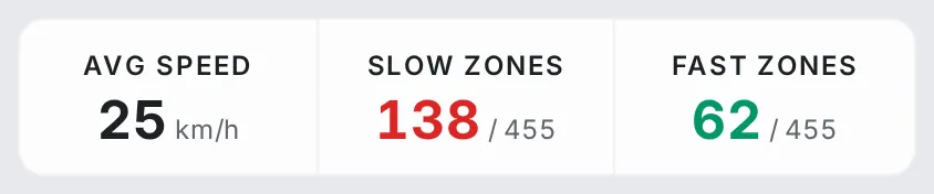
At the top, a strip of three numbers whose labels change with the metric:
- Speed: “Avg Speed” · “Slow Zones” · “Fast Zones”.
- Congestion: “Avg Congestion” · “Congested” · “Free Flow”.
- Delay: “Avg Delay” · “High Delay” · “Low Delay”.
- Disruptions: “Total Disruptions” · “With Disruptions” · “Clear Zones” (the areas with no disruptions).
Below it, the ranking (“Hex Ranking” for the hex grid): the top 15 areas for the metric at the chosen hour, each with its name, or for hexagons its cell ID, and its value in the colours of the map. Click a row to open that area.
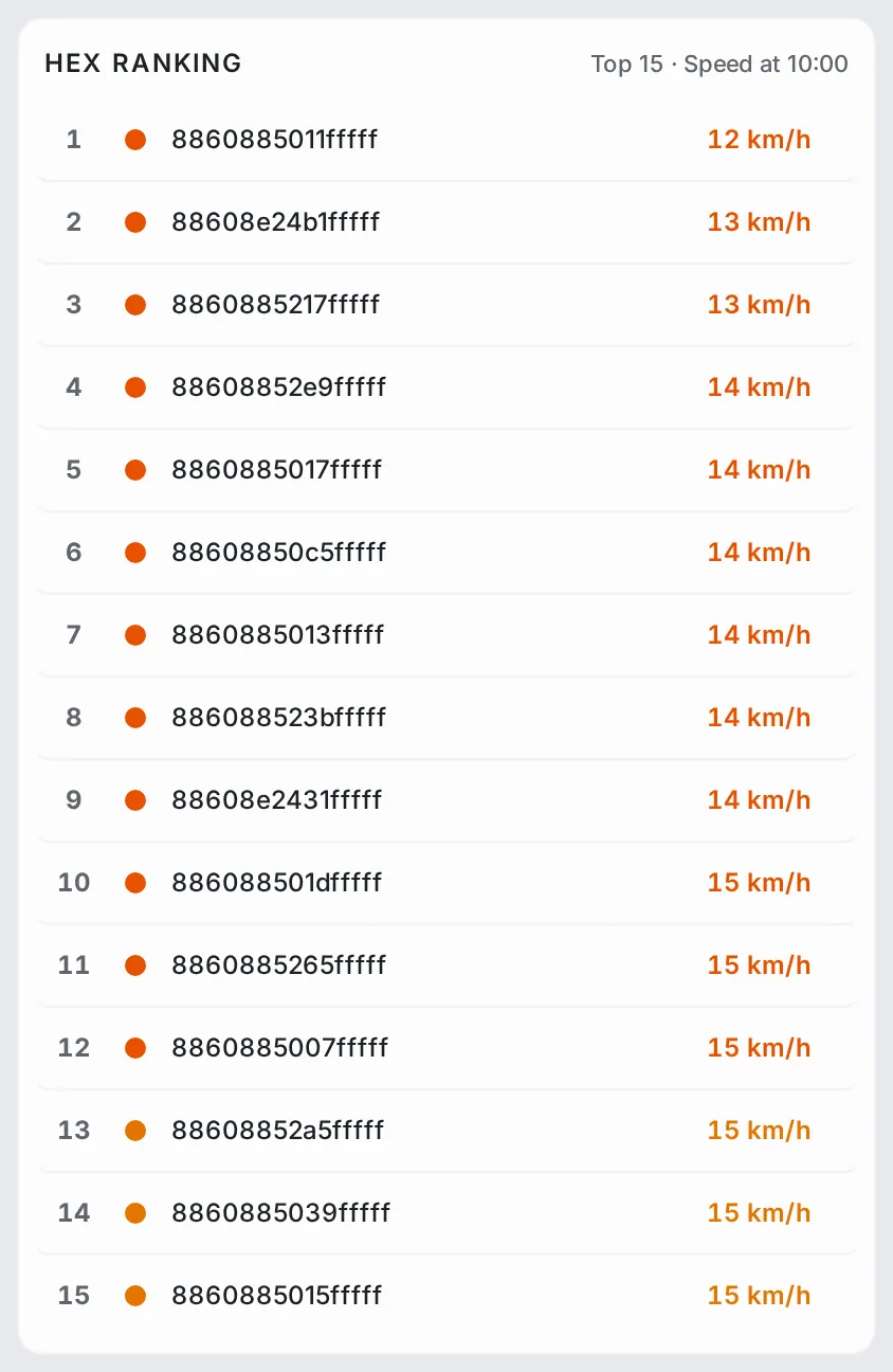
The strip and the ranking update whenever you change the metric, the geography or the hour, so they move with you as you step through the day.
Area details
Open an area in one of two ways: click a row in the ranking, or click the area on the map. Either way the map zooms to it and the side panel switches to its details, with the number of segments inside it and a “Generate Report” button for a report on the area.
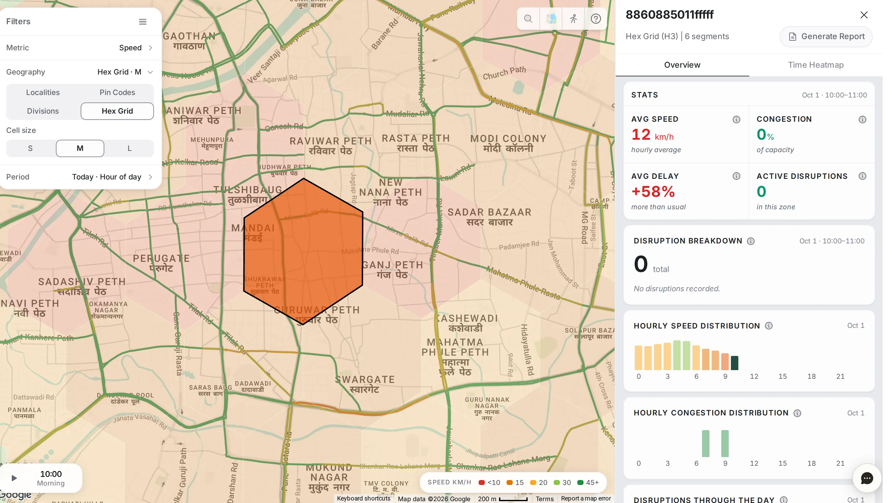
The details have two tabs.
Overview tab
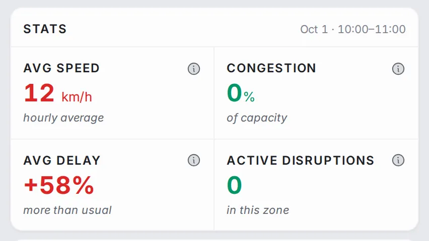
Stats for the chosen hour: the average speed, congestion, the average delay compared with usual, and the active disruptions in the area.
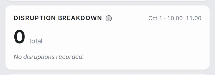
Disruption Breakdown: the disruptions in the area during the chosen hour, by type.
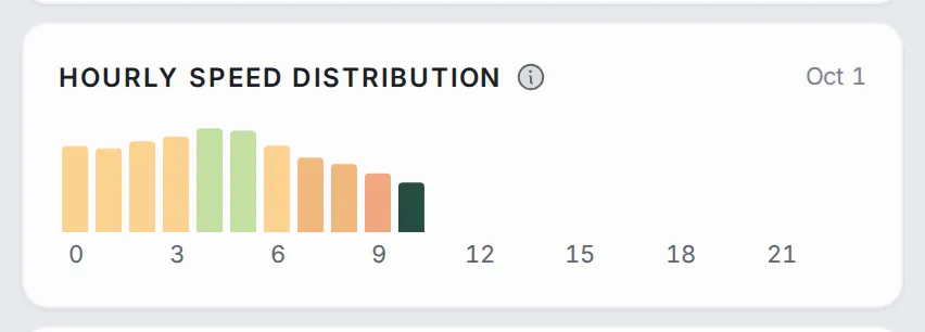
Hourly Speed Distribution: the area’s speed through the day. The dips show when it slows down, and the chosen hour is highlighted.
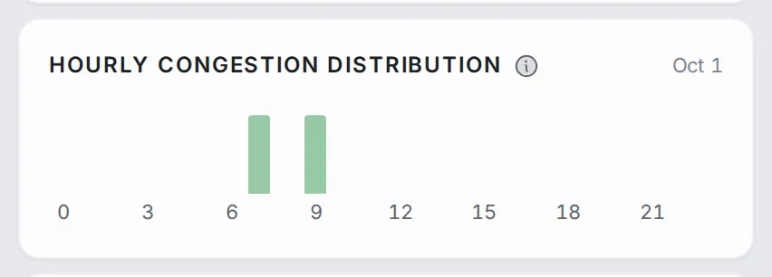
Hourly Congestion Distribution: the same chart for congestion, useful when the average speed looks fine but parts of the area are still jammed.
Disruptions Through the Day: how the area’s disruptions spread across the hours of the day.

Time Heatmap tab
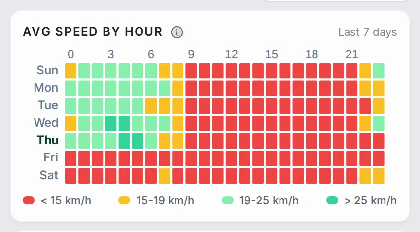
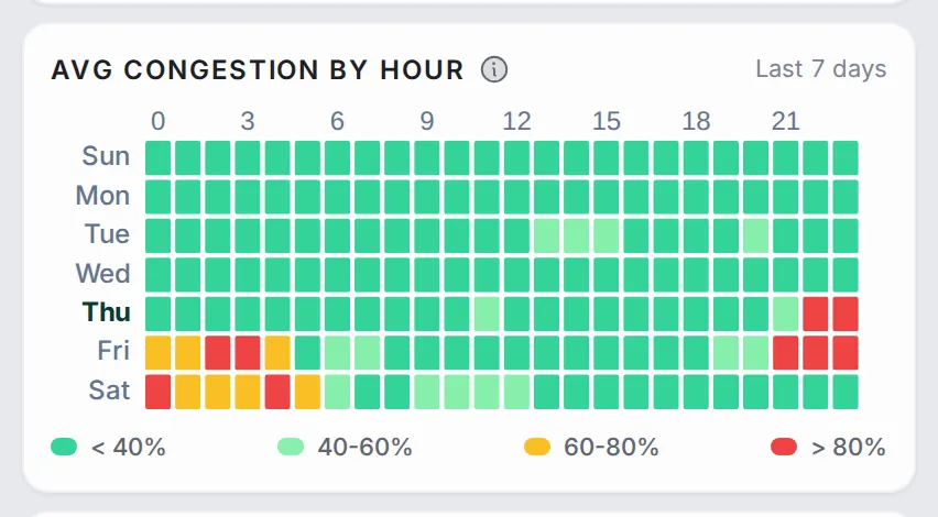
Three heat maps of days of the week by hours of the day, for this area alone over the last 7 days: “Avg Speed by Hour”, “Avg Congestion by Hour” and “Avg Disruptions by Hour”. One look tells you whether the area’s pattern repeats every day (a solid red band across all days), only on working days, or only now and then.
Playing back the day
The time control at the bottom left of the map shows the chosen hour. Click the hour to open the hour bar and jump to any hour of the day, or press play to step through the day hour by hour, then pause on the hour you want.

The whole page follows the hour: the map recolours, the ranking shifts and the city summary updates. Press play to watch your city’s day in under a minute.
Common workflows
- Find the most congested areas now: set the metric to “Congestion” and read the top 15. To brief people who think in neighbourhoods, switch the geography to “Localities”.
- Pick a quiet window: press play and watch the day go by. The hours when the map turns green are the best for road works or fleet movements.
- Diagnose an area that is always jammed: open the top-ranked area, then the “Time Heatmap” tab. A solid red band across the working days is structural; scattered squares are one-offs.
- Plan for an event: pick a similar day from the past under “Period” and step through the hours to see where congestion built up, so you can place resources ahead of time.
- Link congestion to disruptions: set the metric to “Disruptions” and choose a type, to see which areas keep having crashes or lane closures.
Who it’s for
- Planners mapping problems by locality, pin code, division or hexagon.
- Operations teams choosing the right window for road works, deliveries or movements.
- Decision-makers briefing stakeholders who think in areas: localities, wards, divisions.
Related modules
From a congested area, go to Analytics to read the roads inside it one by one, and check Alerts to see whether active alerts are behind the colour. For the numbers that sum up the whole city, go back to Network Analytics.
The screen at a glance
The city as localities, coloured by speed, delay, congestion or disruptions, for any hour. Hover a number to find it on the screen.
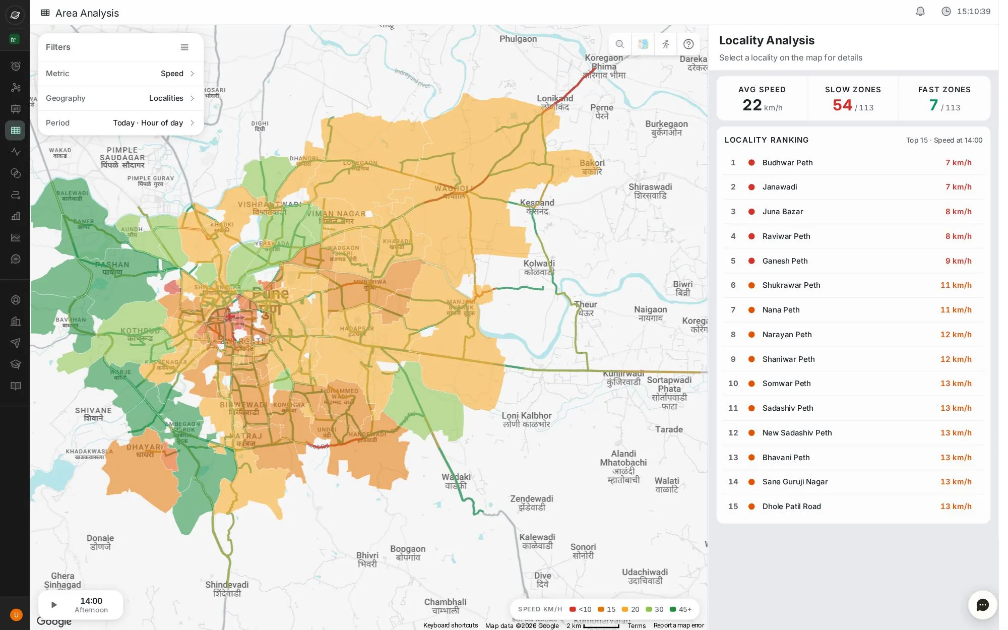
- 1Filters: metric, geography (localities or hex grid) and period
- 2Localities coloured by the metric; click one for detail
- 3City summary for the hour
- 4The 15 worst localities
- 5Timeline: play the day or pick an hour
Step by step
Guides that walk you through this module in the live app, one click at a time.